


Since the 1960s, residents of the Dutch city of Rotterdam have been bugged by an unsightly cigar shop on Coolsingel, one of its busiest streets.
Years passed, and the eyesore welcomed a new tenant, the U.S.-based fast food chain McDonald’s.
For 45 years, the branch continued to operate in the dated building until finally it received a much needed facelift earlier this year, designed by Mei Architects.
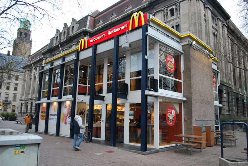 The original building
According to Dezeen, the original glass building, attached to a much older post office, was voted by Rotterdam’s residents as the ugliest structure in the city, and local officials were ready to demolish it. But McDonald’s still had 40 more years on the lease—the redesign route was taken instead.
"Since the 1970s the McDonald's pavilion has been altered frequently. Its quality suffered as a result, with its mostly closed facades. This makes the space anonymous. We want to activate this space again," the design studio’s founder, Robert Winkel, told Dezeen.
The resulting structure is a rectangular glass building with a perforated golden façade, and sleek, white grand spiral staircase. Etched to the façade is pixelated imagery of a crowd, responding to the restaurant’s bustling site. The new building was also detached from the post-office, making it seem more like a pavilion.
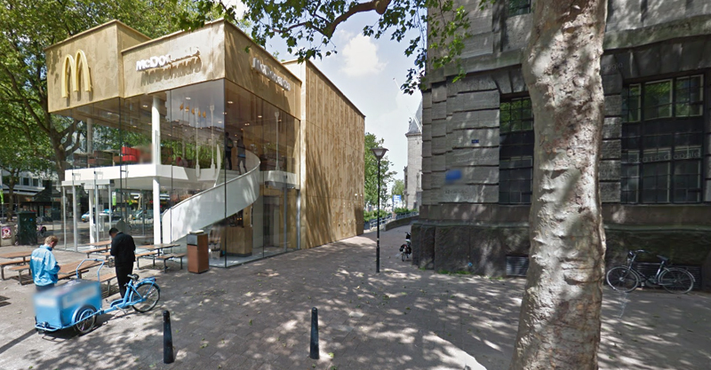 The building is now separated from the much older post office edifice, making the restaurant more like a pavilion. The golden perforated panels depict a pixelated image of a crowd.
Transparency was a key concept in the design. The color-to-ceiling window idea from the original building was kept.
"The transparency and openness, as well as the depicted crowd on the facade panels, emphasize that McDonald's is for everyone, for every Rotterdam resident," Mei Architects' Marloes Koster tells AdFreak.
Onlookers can glimpse into the kitchen as well as get a hint of the grand staircase. By day it reflects sunlight, and the building maintains its glow when sun falls.
"As McDonald's is open day and night, 24/7, its appearance after dark is important," the team told Dezeen. "By day the building is inviting to shoppers, while in the evening it glows to attract the nightlife crowd."
AdWeek reports that the building won an Iconic Award 2015 prize for excellence in architecture and design.
Related Stories

Retail Centers | Oct 5, 2015
Minnesota’s massive Mall of America looks to nearly double its size
One phase is under construction, a second has been proposed, and a third is on the drawing board.

Multifamily Housing | Oct 1, 2015
Wiel Arets unveils twin, 558-foot mixed-use towers in Bahrain’s capital
The development, Bahrain Bay Tower, will consist of two residential towers connected “by a plinth of retail, office, parking, and public park space.”

Giants 400 | Sep 8, 2015
RETAIL SECTOR GIANTS: Callison RTKL, PCL Construction, Jacobs among top retail sector AEC firms
BD+C's rankings of the nation's largest retail sector design and construction firms, as reported in the 2015 Giants 300 Report

Retail Centers | Aug 31, 2015
Urban developers add supermarkets to the mixes
Several high-rise projects include street-level Whole Foods Markets.

Retail Centers | Aug 27, 2015
Vallco Shopping Mall renovation plans include 'largest green roof in the world'
The new owners of the mall in Cupertino, Calif., intend to transform the outdated shopping mall into a multi-purpose complex, topped by a 30-acre park.

Retail Centers | Aug 10, 2015
Walgreens’ flagship in Hawaii harkens back to the island’s fishing culture
A house where canoes were made served as the model for this drug superstore’s design.

Retail Centers | Jul 27, 2015
Fish-shaped shopping mall designed for odd plot of land in China
The mall, in Qinshui, a city in China’s Shanxi province, will fit within the 250x30-meter dimensions surrounded by parallel roads and two converging rivers.

Retail Centers | Jun 30, 2015
Glass-clad, 'communal' Whole Foods approved in Miami Beach
The design for the Whole Food Market features a grid of white concrete representing a pure expression of structure and space, establishing a pedestrian loggia at the ground level, and a floating garden above that screens the parking.

Retail Centers | Jun 29, 2015
Snøhetta releases design for riverfront public market in Portland, Ore.
The James Beard Public Market will be Portland’s first year-round market since 1942, when the Portland Public Market closed down.

Retail Centers | May 26, 2015
5 ingredients of successful mall design
Entertainment, dining, and leisure components, plus the latest technology, are now crucial to making these centers a regular part of customers’ lives.


