


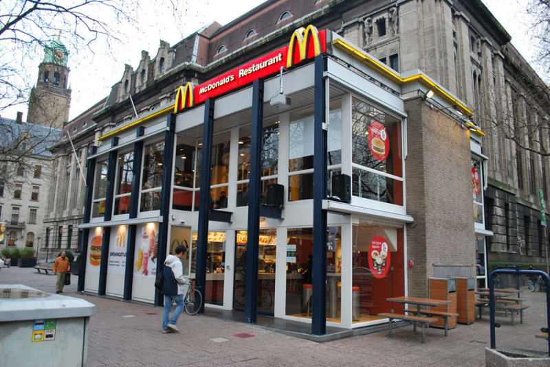
Since the 1960s, residents of the Dutch city of Rotterdam have been bugged by an unsightly cigar shop on Coolsingel, one of its busiest streets.
Years passed, and the eyesore welcomed a new tenant, the U.S.-based fast food chain McDonald’s.
For 45 years, the branch continued to operate in the dated building until finally it received a much needed facelift earlier this year, designed by Mei Architects.
 The original building
According to Dezeen, the original glass building, attached to a much older post office, was voted by Rotterdam’s residents as the ugliest structure in the city, and local officials were ready to demolish it. But McDonald’s still had 40 more years on the lease—the redesign route was taken instead.
"Since the 1970s the McDonald's pavilion has been altered frequently. Its quality suffered as a result, with its mostly closed facades. This makes the space anonymous. We want to activate this space again," the design studio’s founder, Robert Winkel, told Dezeen.
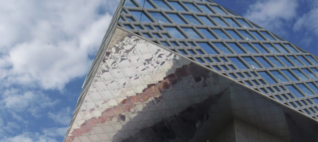
The resulting structure is a rectangular glass building with a perforated golden façade, and sleek, white grand spiral staircase. Etched to the façade is pixelated imagery of a crowd, responding to the restaurant’s bustling site. The new building was also detached from the post-office, making it seem more like a pavilion.
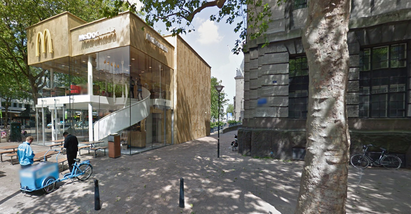 The building is now separated from the much older post office edifice, making the restaurant more like a pavilion. The golden perforated panels depict a pixelated image of a crowd.
Transparency was a key concept in the design. The color-to-ceiling window idea from the original building was kept.
"The transparency and openness, as well as the depicted crowd on the facade panels, emphasize that McDonald's is for everyone, for every Rotterdam resident," Mei Architects' Marloes Koster tells AdFreak.
Onlookers can glimpse into the kitchen as well as get a hint of the grand staircase. By day it reflects sunlight, and the building maintains its glow when sun falls.
"As McDonald's is open day and night, 24/7, its appearance after dark is important," the team told Dezeen. "By day the building is inviting to shoppers, while in the evening it glows to attract the nightlife crowd."
AdWeek reports that the building won an Iconic Award 2015 prize for excellence in architecture and design.
Related Stories
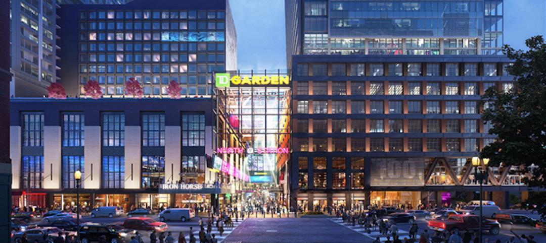
Giants 400 | Sep 13, 2017
Retailers look beyond the sale: Brick-and-mortar retailers are raising their game to lure plugged-in consumers to their stores
Just two months ago, Credit Suisse forecasted that 20-25% of malls will close by 2022.
Giants 400 | Sep 12, 2017
Top 40 retail engineering firms
WSP, Henderson Engineers, and Core States Group top BD+C’s ranking of the nation’s largest retail sector engineering and EA firms, as reported in the 2017 Giants 300 Report.
Giants 400 | Sep 11, 2017
Top 65 retail architecture firms
CallisonRTKL, Jacobs, and Gensler top BD+C’s ranking of the nation’s largest retail sector architecture and AE firms, as reported in the 2017 Giants 300 Report.

Retail Centers | Aug 24, 2017
More than a mall: A collection of experiences
Find out how Gensler transformed one of Silicon Valley’s largest shopping destinations into an immersive lifestyle destination.
Office Buildings | Aug 17, 2017
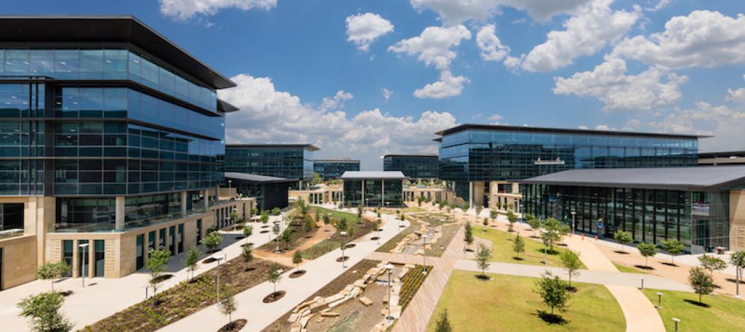
Toyota’s new North American HQ opens in Plano
Toyota invested $1 billion in the project, which was designed by Corgan.
Mixed-Use | Aug 10, 2017
Mixed-use development includes University of California-San Diego campus extension
The 562,000-sf development was designed by Carrier Johnson + CULTURE and is located five blocks from the San Diego Padres’ Petco Park.
Retail Centers | Aug 4, 2017
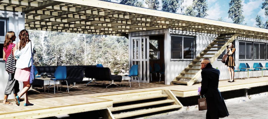
A fast-food restaurant created from recycled shipping containers
Each of the 20-foot-long shipping containers used in the proposal for the Siauliai, Lithuania restaurant are independent and can be easily reproduced.
Retail Centers | Jul 27, 2017
The “New Hybrid” experience: Beyond the mall
Consumers expect more from retailers and brands than ever before.
Retail Centers | Jul 24, 2017
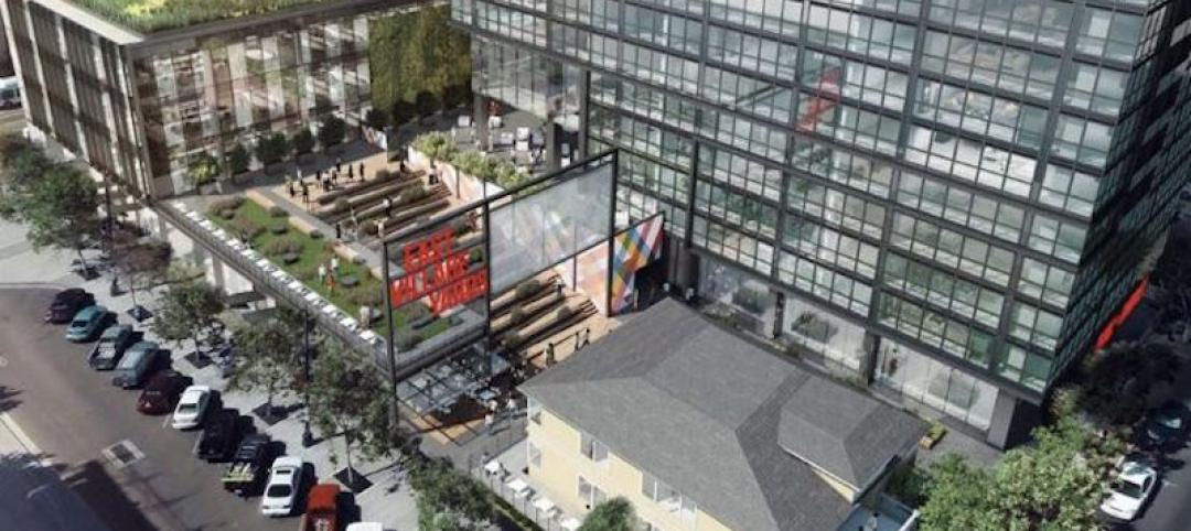
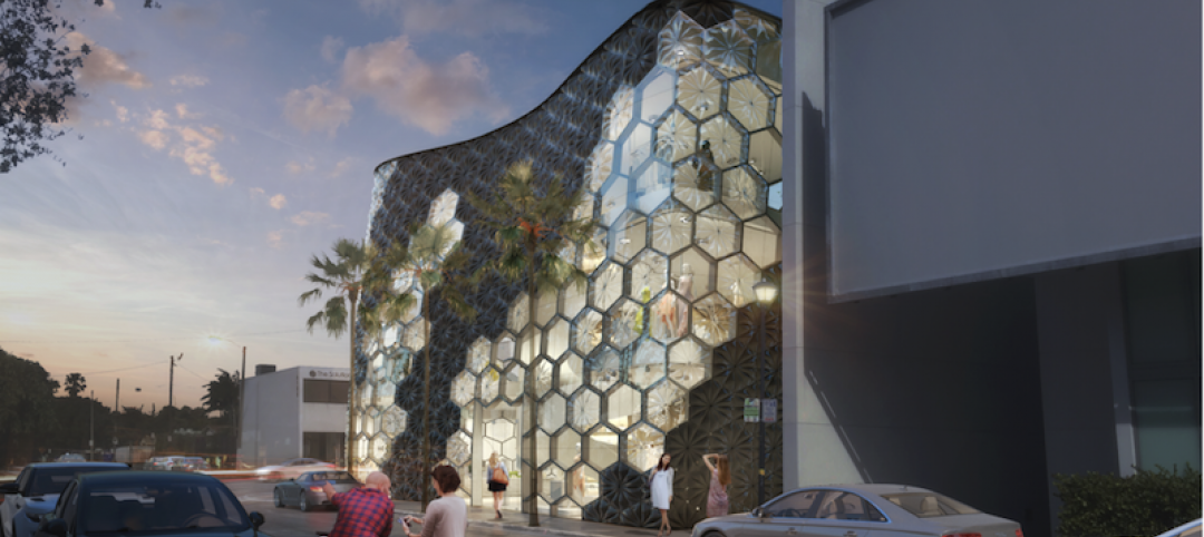
Miami retail structure’s honeycomb façade fluctuates between opacity and transparency
The building will rise three stories in Miami’s Design District.
Retail Centers | Jul 20, 2017
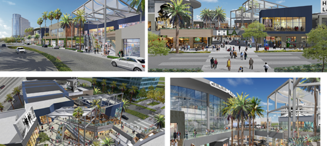
L.A.’s Promenade at Howard Hughes Center receives a new name and a $30 million cash injection
Laurus Corporation and The Jerde Partnership will team up to rebrand the center as a family-friendly dining and entertainment destination.


