Can you make a new building as cool as a warehouse?
“Yes. Yes, we certainly can.”
“Seriously. We cannot find any more old warehouse buildings to renovate, and selling space in the central business district is difficult as corporate buildings are becoming less and less attractive. We need a new building that is attractive to companies that cut their teeth in co-working incubators before seeking their own digs.”
Enter the taxonomy of cool
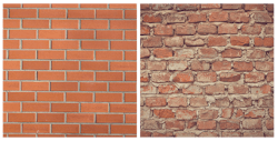
We are a society obsessed with the new. We want to look eternally young, drive the latest car, wear runway fresh clothes and have up-to-the minute technology at our fingertips. We do not care the battery in our phones cannot be changed, because we are happy to simply get a newer phone. The American pursuit of life, liberty, and happiness is a glittering glare of polish and gloss, all sparkling and new. That is, unless we’re talking architecture. Even a well-designed new building can have the appearance of a fresh haircut when the barber cut a little too much. A little weathering can improve the appearance. But with architecture, it’s often about much more than just that. The preference is not limited to such subtle nuance. Consider the image below:
We performed, an admittedly un-scientific survey, asking for a preference between the images. Results were 9:1 in favor of the old wall desperately in need of tuck-pointing. There are many other examples of course, but intuitively we understand this fascination. We wondered if we could identify attributes and codify strategies to take advantage of the preferences.
On paper, the warehouse office that features such common masonry is often preferred by tech companies, creative agencies and start-ups – even though they shouldn’t be all that desirable. Deeper floor plates put people further from smaller windows. It’s often more challenging to regulate temperature. The neighborhoods in which they are located can be remote and further from public transportation. The list goes on, but it doesn’t matter because they have that same je ne sais quoi appeal as the crumbling brick wall. The stock of these properties is finite. Can a new or existing office building have the same appeal? What makes these warehouse office buildings so cool?
Authentic disorder
The brick images begin to answer that question. On the right—weathered bricks, with aged mortar oozing out—the wall carries with it a sense of character, a sense of time. It feels authentic, where the wall on the left is so perfect it feels machined and sterile. The degree of disorder or uncertainty in a system (entropy) influences how we respond to it.
On the left, there is no disorder, nothing suggested other than what it is on the surface. The wall on the right is expressive, a poem in clay and mortar filled with the beauty of inflections and innuendos. This is true of the other materials found in lofts—battered heavy timbers, cracked concrete, corroded metal covered in a century’s worth of enamel. They give us something to respond to, something with which to make an emotional connection.
So, problem solved. Use old looking materials.
Not so fast.
A human core
Finishes are certainly important but they alone do not make an experience. There is a spatial experience the drives the soul of the workplace. The prototypical office building places a solid core at the center of the floor plate. It’s a perfect model for companies looking to build out offices along the perimeter. It’s a model that’s becoming increasingly rarified as organizations recast their workplaces as a landscape of different work typologies instead of the black and white way they’d been defined for decades: open vs. closed, cubicles vs. private offices.
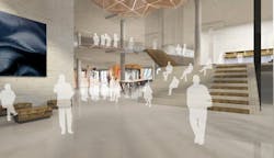
The repurposed warehouse or factory was designed for its first life to have big central spaces for work or goods. The freight elevators were pushed to the perimeter. Repurposed as office, the big spaces allow for people to be at the center of the space. Rather than a solid building core, the center is a café, huddle rooms, soft seating areas and quiet nooks. These are big spaces vertically as well, trading the standard 9’ ceiling in most office towers for soaring rafters.
Co-working culture
The “people core” possesses properties rarely found in a downtown high-rise. Coming out of incubator spaces, or being accustomed to working collaboratively throughout school, people who prefer these buildings tend to want to feel connected with the people working around them, even if they don’t ever directly work with them. Shared spaces, relaxed rules, bring your dog to work days—all build a spirit of connection to something more than another day at the office. Compare that to a traditional commercial office building filled with security gates, security guards, rules, and restrictions and companies stacked anonymously one upon another into the sky.
Creating cool
So what does this mean for us? Once the city’s last defunct machine shop is used, that’s it, right? No, it means we need to start looking at our traditional office space differently. Just as we looked at that boarded up warehouse and thought it could be something other, office towers can be reborn.
This could mean investments in making changes to the structures themselves to create larger volume spaces. Or, it could be a modification to how they’re leased—thinking of space vertically rather than hugging the core. It could be the creation of a shared co-working space within the building that is paid for through each tenant’s rent. Likewise, as we develop new buildings, we don’t need to adhere to the old model. We can design new buildings that capture those things people find so desirable in loft buildings, from the volumes to the spirit of kinship between the tenants.
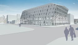
Finally, as we develop new buildings, we can use these lessons not to try and create copies of loft buildings, but to create something new that builds on what we’ve learned. To try and replicate would betray the authenticity cardinal to their appeal. We recently completed a study for a speculative building that’s at once iconoclastic and iconic.
Within its sculptural form, chipped away to reveal the life within, the design affords remarkable planning efficiency and gives tenants those spaces they might have thought could only be found in a formerly derelict building—high ceilings, big spaces to congregate and shared space for everyone in the building to use, regardless of company. As we study old warehouses as new office typologies, and investigate the entropy of materials, we’ve discovered the real cool is community.
About the Author: Robert Benson leads CannonDesign's build-to-suit and develop-driven efforts while helping clients enhance the depth and value of their interior architecture environments. Regarded for his ability to leverage design to empower clients in these areas, Benson brings value to organizations needing solutions for build-to-suits, speculative office buildings, interior architecture, and building respositioning. Benson's work has been honored with numerous AIA and IIDA Design Awards as he has delivered solutions for Certus Bank, Electronic Arts, Playboy, Pinnacle Entertainment, and the General Services Administration.


