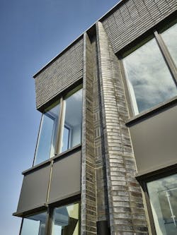
When a building material makes it possible for structures to last literally for centuries, as fired clay brick does, it’s not surprising that it would come to be associated with tradition. It only makes sense that many of the historic buildings we point to as beloved landmarks were built with brick! Brick is so intertwined with the past that today’s designers still often choose it to convey a traditional style — or at least a familiar feel — even in new structures.
But, brick’s adaptability to a variety of old and new looks is what has made it the premier building material for centuries even as preferences have changed and styles have come and gone. Nothing says “classic” like brick, but nothing says “innovative” like brick either.
Labeling something as contemporary architecture is fraught with potential debate, since the term itself points to the lack of a definition for the architecture of the 21st Century more than it describes a single style. What is clear, though, is that fired clay brick remains a major presence in the 21st Century designer’s palette. Not convinced? Check out some examples.
The Moody Center for the Arts at Rice University gets high marks for innovative use of brick. Eschewing conventional masonry design themes - where materials with physical or implied heft are concentrated at the structure’s base - the design by Michael Maltzan Architecture lifts brick upward and even cantilevers it horizontally, making the brick appear to float. Brick clad upper stories extend to shade the walkways below, adjacent to ground level glass walls, stretching to connect two dramatic design elements at opposite ends of the structure. A screen wall of brick hovers with apparent weightlessness over an outdoor courtyard in one direction, while a teardrop-shaped penetration in the masonry a full story in height further emphasizes a feeling of lightness and openness that counters the nearly-black brick.
Brick design architectural detail on Rice University Moody Center for the Arts. See more photos
Another contemporary use of brick is the Dr. Jorge Prieto Math and Science Academy in Chicago’s Belmont-Cragin neighborhood. Here, designing architect SMNG-A Architects created a deceptively simple structure with layers of subtle beauty that are revealed upon study. The three-story building emphasizes a horizontal orientation, enhanced by the half-bond coursing of 2 1/4” high, 15 5/8” long brick. The structure is perceived as a single mass of masonry, thanks to its simple geometry, mild brick color variations, and a non-contrasting mortar color. But a closer look at the Academy building reveals thoughtful details. Deeply inset window openings on the west elevation give depth to the otherwise straightforward facades and emphasize the building’s mass while casting prominent shadows. Custom brick shapes provided the angles there, preserving the monolithic quality of the masonry wall and avoiding mitered corners. And, on the east side, the brick lattice wall at the cooling tower well screens mechanical equipment while avoiding the need for a 60' long expanse of louvers.
Brick design architectural window detail on Prieto Math and Science Academy. See more photos
Brick’s versatility was on display when ODA New York was challenged to create a modern high-rise residential building that would fit into a traditional, old world neighborhood. In designing 371 Broadway in Manhattan’s historic Tribeca neighborhood, ODA seized on the area’s prominent cast iron craftsmanship and used custom-made brick shapes in a basket weave pattern as an expression of the neighborhood’s past. The curved details of the special brick shapes not only call to mind the cast iron features of nearby structures, but also lend a scale to the new, larger structure that is a better fit among its pre-war neighbors. According to ODA, “An ancient material that lends itself to timeless design, the brick used here resembles the depth and decorative character created by cast iron facades and their articulated columns.” The project included 23 custom brick shapes and special masonry anchors.
Custom brick design architectural detail on 371 Broadway Building. See more photos
And, finally, brick thoroughly blurs the lines between the stylistic old and new in the Spears School of Business at Oklahoma State University. Project architect Rand Elliott called heavily on the tradition of Georgian architecture at OSU, using true Georgian principles and true fired clay brick to create the “bookend” landmark for the campus, connecting the east-west axis of Legacy Walk. The structure’s footprint reflects the crescent forms that occur frequently in the Georgian architecture of Bath, England. The design, while referencing a historical style, leverages one of brick’s superpowers – the ability to play well with a variety of modern materials. In this case, lower level floor-to-ceiling glass fills the space between traditional columns, with the brick above seamlessly reconciling the old and new feels. While brick in the wall connects traditional to contemporary, brick pavers in the crescent courtyard and the interior corridor connect outside to inside, blurring the line between.
Brick design architectural detail on OSU Spears School of Business building. See more photos
For millennia, designers have creatively used brick’s myriad combinations of textures, colors, and sizes to achieve their desired look. The most traditional aspect of brick, as it turns out, is the tradition of talented architects, designers, and builders doing surprising things with brick. That history continues with 21st Century architects, using brick as their medium, designing structures that defy any label — just like contemporary architecture itself.
Contact info:
- Email: [email protected]
- Website: https://www.heartlandbrick.org/


