Color Harmony and How Colors Interact
By Sherwin-Williams Coil Coatings
Color harmony, meaning the principle of colors working well together, is a significant component of design. Architects, designers and specifiers must strategically consider how colors will interact in their projects – whether in pops of color or subdued consistency.
What is color harmony?
To understand different types of color harmony, one must first determine the context in which the term is being used. Designers define and achieve color harmony in two distinct ways: through color matching or color wheel alignment.
- Harmonious color matching
The first color harmony definition relates to matching color across technologies and substrates. For example, one structure could include metal, plastic and fiberglass building products that all need to be the same color. Therefore, the coatings must be color-matched according to each unique substrate and the coatings technology applied.
Similarly, color harmony must also exist between the coil and extrusion application processes. Each process requires distinct formulations and codes that are carefully designed to achieve the same color in two different applications. - Harmony based on the color wheel
A classic method of understanding color harmony is through the color wheel. Placement on the color wheel is determined by a color’s tint, tone, saturation, chroma and luminosity. Designers use color wheel theories to determine which colors will work together harmoniously, or in other words, aesthetically.
Types of color harmony
For designers basing color harmony on the color wheel, there are different types of color harmony to choose from.
Monochromatic color harmony
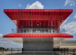
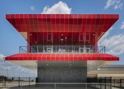
Monochromatic color harmony deals with shades deriving from one color family and is generally more subdued. The project could be a home in varying shades of blue, a hospital in degrees of white or a school facade in a spectrum of inky blacks to cool grays. For example, Del Valle High School used shades of red Fluropon® coatings for parts of the building, bringing a monochromatic design to its facade.
Analogous color harmony
Analogous color harmony spans two to three color families that sit adjacently on the color wheel. Like monochromes, analogous harmony schemes have lower contrast levels. The yellow-orange-red hues of autumn and the blue-green exterior paneling of SEI Investments are both analogous color harmony examples.
Complementary color harmony
Colors that sit opposite each other on the color wheel create complementary color harmony. Examples include high-contrast pairings of pink and green, or blue and orange as distinguished in the designCraft office’s shades-of-blue doorway and rusty orange wall panels.
Split complementary color harmony
Going a step further, split complementary color harmony incorporates three complementary colors, which create a Y shape on the color wheel. Where pink and green create complementary color harmony, yellow can be added to achieve a split complementary design, as seen in the fun and colorful Give Kids the World Village.
Color harmony in architecture
Color harmony can shift and change to meet the needs of designers. The principle guides the foundations of design, yet still allows ample room for creativity. Designers are not limited to high or low contrasts and can combine colors to create complex neutrals such as grays, beiges and browns. Whether designers and manufacturers are looking to blend in or stand out, there is a spectrum of color combinations to support inventive designs.
- Inspiration for architects
At Sherwin-Williams Coil Coatings, our teams develop resources to assist designers, specifiers and manufacturers with their creative, colorful visions. Our color forecasts and market- and region-specific building product lookbooks provide carefully researched and deeply inspired tools to achieve harmonious color and design.
Contact a Sherwin-Williams color expert for support in your color and design journey.


