Google releases new plans and renderings of its Mountain View campus
By David Malone, Associate Editor
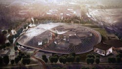
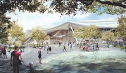
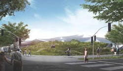
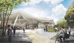
The circus is headed to Mountain View, Calif.! Or, at least that’s what it looks like, as the newly released design plans for Google’s new Charleston East campus show a building with the appearance of a giant futuristic circus tent. However, despite the color of Google’s logo, don’t expect to see this building filled with clowns or acrobats, as the building will incorporate many state-of-the-art features to provide the most efficient workplace possible.
Back in February 2015, Google released its initial plans for the project, but this past February saw them update and alter those plans. The most visible difference between the plans is the loss of a translucent canopy that was meant to regulate climate, air quality, and sound while enclosing flexible building segments that had the ability to be moved around both inside and outside of the enclosure. For any of you thinking to yourself, Simpsons did it! Simpsons did it! Yes, the design looked a little bit like when The Simpsons Movie put a glass dome over the entirety of Springfield.
The canopy is still in place and it is still designed with the purpose of regulating indoor climate, air quality, and sound, but the plans now call for it to be opaque. The building components are still labeled as "flexible" and are designed to be adaptable to Google’s changing needs, but they seem to have lost at least some of their originally planned mobility.
Photovoltaic panels will be incorporated over much of the canopy’s surface to generate as much electricity from renewable resources as possible. The actual amount of electricity that would be generated is still being studied.
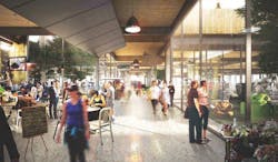
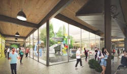
In another effort to help decrease electricity consumption, the structure uses smile-shaped clerestories that span two sides of each 102-foot bay to bring direct, indirect, and diffused natural light into the building. The way the building is designed and laid out makes it so even the centers of the lower level floor plans are able to receive natural light. Google is still experimenting with different glazing strategies and technologies to control and scatter direct sunlight in order to minimize glare.
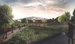
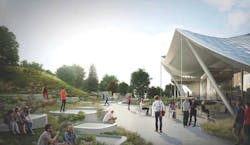
The building is designed with nature in mind and the landscape strategies of the building aim to nurture and restore native ecologies of the North Bayshore area. Google is working with local ecological consultants and wildlife experts in an effort to help wildlife species on the site to thrive. Not much has been overlooked, as bird safety has even been integrated into the design. The building plans call for bird-friendly design elements to help eliminate any birds flying into windows or other areas using clear glass or disturbing migration patterns with light pollution. Some of these design elements are fine-grained visual obstacles in the vertical envelope glass coatings that reduce reflection, limited light pollution at night, and carefully placed vegetation.
The overall design concept is driven by five guiding principles to provide the highest quality work environment possible and represent a vision for the workplace of the future. These design principles are:
- Beauty and simplicity
- Flexible and hackable spaces
- Ecology and access to nature
- Efficiency of resources and materials
- Health and environmental quality
Google is hoping these guiding principles will help them achieve LEED Platinum certification.
While the new building lost its visionary clear canopy made, the new plans still present an innovative, modern design that blends in with the surrounding ecosystems and landscape instead of standing in stark contrast to them. And, who knows, maybe Cirque du Soleil will get mixed up and think the building is their tent one day, leading to some very good lunchtime entertainment. However, the company is still in the early stages of planning this structure and there is still plenty of work that needs to be done before any type of construction begins.
Google chose Bjarke Ingels Group and Heatherwick Studio as design consultants for the project, Adamson Associates as the architect of record, Arup as the structural/MEP engineer, and Hargreaves Jones Landscape Architecture as the landscape consultant.
The plans can be viewed in their entirety on the City of Mountain view website.
