Capital One eschews the traditional bank with the Capital One Café
By David Malone, Associate Editor
A new modern building designed by Gwynne Pugh Urban Studio looks to create a new concept in banking that forgoes traditional tellers behind a counter and replaces them with more communal space with mobile financial advisers available to assist both bank clients and non-clients.
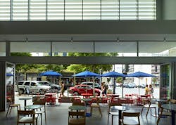
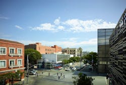
The new two-story, 8,400-sf branch, dubbed the Capital One Café, is located at the intersection of 4th and Broadway in downtown Santa Monica. It was designed so the corner was opened up and made into an indoor-outdoor space separated by folding doors.
Photo courtesy of Studio J Marketing.
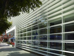
The first and second floors along the Broadway elevation are primarily composed of clear anodized low-glazed aluminum windows with fixed powder-coated white aluminum louvers that cover the windows. The rear portion of the building and the upper portion of the 4th Street elevation are composed of glossy winter white glazed brick tiles. The ground level of the 4th Street elevation is finished with fixed clear anodized low-glazed aluminum windows and an entry swing door that leads into a vestibule area.
Visitors enter via an entry plaza that is set about nine feet from the existing sidewalk. The ground floor is fully transparent while the rest of the building incorporates partially screened louvers and solid walls clad in glazed brick tiles
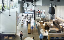
The interior was designed by IA Interior Architects and presents an open, naturally lit space. At one end of the lobby is the café, which serves Peet’s Coffee and pastries. The café is surrounded by a variety of seating and communal workspace options. At the other end of the lobby is where customers can find the Capital One employees. Private consultations can take place in small rooms with sliding doors located at the end of the lobby behind the employees. Conference rooms that can be reserved by non-profits and other organizations are also available.
Photo courtesy of Studio J Marketing.
The goal of the design was to create a destination that becomes a regular fixture in people’s lives outside of their homes and workplaces, according to Gwynne Pugh Urban Studio.
