


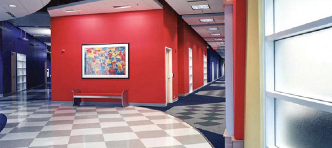
Finishes investigations, which encompass the study of paints, glazes, clear finishes (varnishes, shellacs, lacquers) and their substrates, not only provide invaluable insight about early decoration campaigns but also help track the evolution, chronology, and alteration campaigns of a building. In coordination with a master plan for restoration, the historic color palette and patterns discovered inform the design and construction process and guide the selection of corresponding colors and patterns for new decorative and design elements. Finishes investigations can also include conservation cleaning tests of painted finishes as well as of wood, marble, stone, and metal features, for part of the value of an investigation is the determination of the historic relationship of the diverse architectural features.
Often clients will opt for minimal microscopy services to determine the dominant five or six historic paint colors, which are then applied broad-brush throughout the building. However, it is through archival research, chemical and mechanical exposures (also known as “windows” or “reveals”), and careful microscopic analysis of specific architectural elements that the relationship of interior features and the overall historic design can be best understood.
STEP 1. ESTABLISHING THE TARGET ERA
The first step in a finishes investigation should be the examination of archival information, if any exists. Newspaper articles heralding a building’s groundbreaking, or historic photographs capturing decorative ornament can not only provide details of original design and materials, but can also assist in the pinpointing of a building’s “target era” or “period of significance.” In the 19th century, for example, it was not uncommon to adorn the walls of a newly constructed building with a temporary finish. Once the plaster fully cured, this more basic design would be removed (in the case of wallpaper), washed off (in the case of distemper paints), or simply overpainted. Sometimes these initial decorative schemes were on display for less than a year, in which case the target campaign is actually the second decorative scheme; in other cases, the period of significance for the building dates far beyond the construction date. For example, if a prominent figure resided in a house, thereby imbuing it with landmark status, it is that period of residence that becomes the target era, not its original construction date.
Richard Upjohn’s Grace Church in Brooklyn Heights has four distinct periods of interest. Archival research, coupled with preliminary paint exposures and microscopy, helped outline them as follows: the 1848 construction and initial design; the 1866 polychromatic redecoration and installation of the first stained glass windows; the 1891 redecoration of the interior; and the 1909 structural and architectural alterations, which also included decorative repainting.
Based on initial information gathering, it was determined that the complexity and high style of the second campaign (1866) with bold and vibrant Gothic Revival decoration demonstrated the major period of significance for Grace Church—its “target era.” Findings from this campaign display intricate geometries and bold polychromies that draw heavily on British decorator A.W.N. Pugin’s 1840s pattern books. Pugin published a series of volumes of architectural and ornamental designs, most of which served as standard references for Gothic architecture into the 20th century. Motifs from Grace Church’s 1866 interior appear to have been copied directly out of Pugin’s classic sourcebook, Pugin’s Ecclesiastical Ornament (1844).
On-site investigation consisted of visual inspection of painted surfaces, extraction of samples from selected areas, and exposure of earlier decorative motifs. Sometimes, accretions of motif paints will telegraph through overpaints, and their outlines can be seen in raking light. Using the historic photographs and these ghosting patterns as guides, exposures of the 1866 target era campaign were created on the ceiling panels and beams, upper and lower wall fields, wainscots, and window surrounds.
A large exposure was created at the ceiling, revealing a vibrant pattern of stars and fleurs-de-lis executed in bright yellow, red, white, and tan on a bright blue field. The presenting faux bois ceiling decoration, composed of distemper paint, was water-soluble. Because the 1866 paints are well-bound oil paints that are not water soluble, overpaint removal and large-scale exposure of the 1866 scheme was a relatively quick and straightforward process.
Other sequences of overpaint, however, require far greater expenditures of time, chemicals, and mechanical effort. Fragility of any given paint layer (often due to binding media), adhesion between adjacent paint layers, and texture of a substrate are all factors affecting the difficulty of any given exposure. The textured plaster at the window returns required seemingly endless picking with a scalpel, digging overpaint layers out of the crevices. The results, however, were well worth the effort: the west window return revealed a boldly colored pattern consisting of a green field with a central blue fleur-de-lis motif, bordered by a red field with white flowers and yellow pin striping. Below that, an exposure at the dado revealed floral motifs that were similarly Puginesque and in keeping with the patterns found at the ceiling and window surrounds.
Below the dado, the wall was painted dark brown, presumably to complement or match the wood wainscot on the north and south elevations. Paint stripping at the upper wall masonry bracket indicated only a few layers of modern paint, suggesting that the brackets were originally unpainted. This led to the recommendation to strip the masonry brackets and restore their stone surface to its original intended bare appearance, so its natural texture and color could once again provide visual contrast with the vibrant designs of the adjacent painted surfaces.
STEP 2. DOCUMENTING PATTERNS, MATCHING COLOR
Upon exposure of historic decoration, patterns can be sketched or traced. Dimensions and color annotations are noted directly on the tracings, which can then be scanned, enlarged, and redrawn to create cleaner, more accurate copies of the patterns.
In situ color matching, however, is not always a reliable method of documentation. Colors can shift and fade during chemical exposure. For that reason, colors found on site should always be confirmed via microscopic examination of paint chips in the laboratory. At the Illinois State Capitol, in Springfield, patterns revealed in exposure were considerably paler and less saturated than the paints indicated in cross-section.
Samples collected for microscopic analysis should be removed from the soundest areas of accessible paint. The interior of each color layer is used for color matching, in order to minimize surface effects such as interaction with overlying dirt layers and medium migration within the paint layers. Under magnification up to 400x in daylight-corrected reflected light, the layering sequences of various areas are compared and analyzed in order to relate various historic paint campaigns and overall decorative schemes. Post-historic layers are typically given a descriptive color name, while historic layers are matched either in a commercial paint system (e.g., Benjamin Moore, Sherwin-Williams) or in the Munsell system, which identifies colors within a three-dimensional color space by describing the hue, value, and chroma.
The relative number and sequencing of layers can determine whether or not an element is original to the structure. For example, when examining samples from wood chair rail, if the adjacent wall sample contains 20 layers of paint while the rail sample contains only two, it is likely that the chair rail was a later addition. Similarly, very few paint layers on an exterior window frame typically indicate either that the window was replaced or that the wood was stripped prior to repainting.
With cross-sectional microscopy, decorative finishes such as glazes, marbling, or wood graining can often be detected. Aluminum, gold, silver, and composition leaf (a blend of zinc, brass, and copper, often referred to as “Dutch metal,” that mimics the appearance of gold leaf) can also be identified.
At the Loew’s Kings Theatre in the Flatbush section of Brooklyn, N.Y., our firm created exposures in multiple locations to reveal the gold and silver finishes original to 1929. Oxidation of metallic pigments and leaf, water damage, soiling accumulation, and extensive flaking and paint failure belie the true grandeur of the 1929 decoration. At first look, it seemed inconceivable that every surface was originally leafed, so massive is the interior. But after microscopic analysis of more than 150 samples, it was confirmed that the entire ceiling and the vast majority of wall surfaces in the 3,200-seat theater, as well as in its lobby and promenade, were originally finished with composition leaf, which was hand-burnished onto the surface and coated with amber shellac.
Drawing on the patterns and layout uncovered through exposure in conjunction with the colors and finishes found through microscopy, studio designers can create maquettes for each motif. Using these maquettes, they then produce renderings, which will display a unified design scheme for the interior.
More Scientific Tools that Can Aid Your Finishes Analysis
Additional analytical and testing methods can determine the composition of historic materials and refine the restoration scope.
- Solvent tests can be performed on site and are valuable tools in the determination of metal and wood finishes.
- Cleaning tests, inpainting tests, and consolidation tests can be performed at the same time as a finishes investigation and help in the development of specific treatments for conservation or restoration.
- Polarized light microscopy can be used to isolate and identify specific pigment or fiber particles based on their shape, size, refractive indices, and birefringent properties under cross-polar light, which can help in the dating process. For example, if you identify the white pigment in the first paint layer as titanium white, you can date the element (or paint campaign) to post-1917, when titanium white was first manufactured (though it was not produced in the U.S. until 1921).
- Ultraviolet light microscopy (UV) can help identify glazes and clear finishes.
- Fluorescent staining, Fourier transform infrared spectroscopy (FTIR), and gas chromatography–mass spectrometry (GC-MS) can assist in the identification of binding media and clear finishes.
STEP 3. DEVELOPING A UNIFIED DESIGN SCHEME
When the mosaic floor was laid in Grace Church in 1891 and the stained glass windows were installed between 1867 and the early 20th century, designers of these elements referenced and integrated colors and motifs from the 1866 paint campaign that persisted on the sanctuary walls and ceiling. As a result, despite the fact that Grace Church’s interior elements were altered at different times, the overall decoration was consistently presented as a unified whole, rather than as a piecemeal collection of divergent artistic styles and eras.
In much the same way that the patterns and motifs of Grace Church’s 1866 decoration were reflected in the design of the interior elements added during subsequent campaigns, so too was the 1866 color palette referenced and replicated.
Combining the archival and physical evidence, EverGreene designers work in tandem with the architectural team to produce new interior designs that reflect those of the target era. In Loew’s Kings Theatre, for instance, the historic color palette was used to select the colors for the newly designed drapery, stage curtain, carpets, and seating, as well as to determine appropriate levels of lighting. In this way, a building’s true form and intended appearance, often hitherto concealed above dropped ceilings and beneath multiple coats of overpaint, can guide a restoration program that is sensitive to the building’s history. BD+C
Related Stories

| Nov 3, 2010
Dining center cooks up LEED Platinum rating
Students at Bowling Green State University in Ohio will be eating in a new LEED Platinum multiuse dining center next fall. The 30,000-sf McDonald Dining Center will have a 700-seat main dining room, a quick-service restaurant, retail space, and multiple areas for students to gather inside and out, including a fire pit and several patios—one of them on the rooftop.
| Nov 2, 2010
11 Tips for Breathing New Life into Old Office Spaces
A slowdown in new construction has firms focusing on office reconstruction and interior renovations. Three experts from Hixson Architecture Engineering Interiors offer 11 tips for office renovation success. Tip #1: Check the landscaping.

| Nov 2, 2010
Cypress Siding Helps Nature Center Look its Part
The Trinity River Audubon Center, which sits within a 6,000-acre forest just outside Dallas, utilizes sustainable materials that help the $12.5 million nature center fit its wooded setting and put it on a path to earning LEED Gold.

| Nov 2, 2010
A Look Back at the Navy’s First LEED Gold
Building Design+Construction takes a retrospective tour of a pace-setting LEED project.
| Nov 2, 2010
Wind Power, Windy City-style
Building-integrated wind turbines lend a futuristic look to a parking structure in Chicago’s trendy River North neighborhood. Only time will tell how much power the wind devices will generate.

| Nov 2, 2010
Energy Analysis No Longer a Luxury
Back in the halcyon days of 2006, energy analysis of building design and performance was a luxury. Sure, many forward-thinking AEC firms ran their designs through services such as Autodesk’s Green Building Studio and IES’s Virtual Environment, and some facility managers used Honeywell’s Energy Manager and other monitoring software. Today, however, knowing exactly how much energy your building will produce and use is survival of the fittest as energy costs and green design requirements demand precision.

| Nov 2, 2010
Yudelson: ‘If It Doesn’t Perform, It Can’t Be Green’
Jerry Yudelson, prolific author and veteran green building expert, challenges Building Teams to think big when it comes to controlling energy use and reducing carbon emissions in buildings.
| Nov 2, 2010
Historic changes to commercial building energy codes drive energy efficiency, emissions reductions
Revisions to the commercial section of the 2012 International Energy Conservation Code (IECC) represent the largest single-step efficiency increase in the history of the national, model energy. The changes mean that new and renovated buildings constructed in jurisdictions that follow the 2012 IECC will use 30% less energy than those built to current standards.

| Nov 1, 2010
Sustainable, mixed-income housing to revitalize community
The $41 million Arlington Grove mixed-use development in St. Louis is viewed as a major step in revitalizing the community. Developed by McCormack Baron Salazar with KAI Design & Build (architect, MEP, GC), the project will add 112 new and renovated mixed-income rental units (market rate, low-income, and public housing) totaling 162,000 sf, plus 5,000 sf of commercial/retail space.

| Nov 1, 2010
John Pearce: First thing I tell designers: Do your homework!
John Pearce, FAIA, University Architect at Duke University, Durham, N.C., tells BD+C’s Robert Cassidy about the school’s construction plans and sustainability efforts, how to land work at Duke, and why he’s proceeding with caution when it comes to BIM.


