


Finishes investigations, which encompass the study of paints, glazes, clear finishes (varnishes, shellacs, lacquers) and their substrates, not only provide invaluable insight about early decoration campaigns but also help track the evolution, chronology, and alteration campaigns of a building. In coordination with a master plan for restoration, the historic color palette and patterns discovered inform the design and construction process and guide the selection of corresponding colors and patterns for new decorative and design elements. Finishes investigations can also include conservation cleaning tests of painted finishes as well as of wood, marble, stone, and metal features, for part of the value of an investigation is the determination of the historic relationship of the diverse architectural features.
Often clients will opt for minimal microscopy services to determine the dominant five or six historic paint colors, which are then applied broad-brush throughout the building. However, it is through archival research, chemical and mechanical exposures (also known as “windows” or “reveals”), and careful microscopic analysis of specific architectural elements that the relationship of interior features and the overall historic design can be best understood.
STEP 1. ESTABLISHING THE TARGET ERA
The first step in a finishes investigation should be the examination of archival information, if any exists. Newspaper articles heralding a building’s groundbreaking, or historic photographs capturing decorative ornament can not only provide details of original design and materials, but can also assist in the pinpointing of a building’s “target era” or “period of significance.” In the 19th century, for example, it was not uncommon to adorn the walls of a newly constructed building with a temporary finish. Once the plaster fully cured, this more basic design would be removed (in the case of wallpaper), washed off (in the case of distemper paints), or simply overpainted. Sometimes these initial decorative schemes were on display for less than a year, in which case the target campaign is actually the second decorative scheme; in other cases, the period of significance for the building dates far beyond the construction date. For example, if a prominent figure resided in a house, thereby imbuing it with landmark status, it is that period of residence that becomes the target era, not its original construction date.
Richard Upjohn’s Grace Church in Brooklyn Heights has four distinct periods of interest. Archival research, coupled with preliminary paint exposures and microscopy, helped outline them as follows: the 1848 construction and initial design; the 1866 polychromatic redecoration and installation of the first stained glass windows; the 1891 redecoration of the interior; and the 1909 structural and architectural alterations, which also included decorative repainting.
Based on initial information gathering, it was determined that the complexity and high style of the second campaign (1866) with bold and vibrant Gothic Revival decoration demonstrated the major period of significance for Grace Church—its “target era.” Findings from this campaign display intricate geometries and bold polychromies that draw heavily on British decorator A.W.N. Pugin’s 1840s pattern books. Pugin published a series of volumes of architectural and ornamental designs, most of which served as standard references for Gothic architecture into the 20th century. Motifs from Grace Church’s 1866 interior appear to have been copied directly out of Pugin’s classic sourcebook, Pugin’s Ecclesiastical Ornament (1844).
On-site investigation consisted of visual inspection of painted surfaces, extraction of samples from selected areas, and exposure of earlier decorative motifs. Sometimes, accretions of motif paints will telegraph through overpaints, and their outlines can be seen in raking light. Using the historic photographs and these ghosting patterns as guides, exposures of the 1866 target era campaign were created on the ceiling panels and beams, upper and lower wall fields, wainscots, and window surrounds.
A large exposure was created at the ceiling, revealing a vibrant pattern of stars and fleurs-de-lis executed in bright yellow, red, white, and tan on a bright blue field. The presenting faux bois ceiling decoration, composed of distemper paint, was water-soluble. Because the 1866 paints are well-bound oil paints that are not water soluble, overpaint removal and large-scale exposure of the 1866 scheme was a relatively quick and straightforward process.
Other sequences of overpaint, however, require far greater expenditures of time, chemicals, and mechanical effort. Fragility of any given paint layer (often due to binding media), adhesion between adjacent paint layers, and texture of a substrate are all factors affecting the difficulty of any given exposure. The textured plaster at the window returns required seemingly endless picking with a scalpel, digging overpaint layers out of the crevices. The results, however, were well worth the effort: the west window return revealed a boldly colored pattern consisting of a green field with a central blue fleur-de-lis motif, bordered by a red field with white flowers and yellow pin striping. Below that, an exposure at the dado revealed floral motifs that were similarly Puginesque and in keeping with the patterns found at the ceiling and window surrounds.
Below the dado, the wall was painted dark brown, presumably to complement or match the wood wainscot on the north and south elevations. Paint stripping at the upper wall masonry bracket indicated only a few layers of modern paint, suggesting that the brackets were originally unpainted. This led to the recommendation to strip the masonry brackets and restore their stone surface to its original intended bare appearance, so its natural texture and color could once again provide visual contrast with the vibrant designs of the adjacent painted surfaces.
STEP 2. DOCUMENTING PATTERNS, MATCHING COLOR
Upon exposure of historic decoration, patterns can be sketched or traced. Dimensions and color annotations are noted directly on the tracings, which can then be scanned, enlarged, and redrawn to create cleaner, more accurate copies of the patterns.
In situ color matching, however, is not always a reliable method of documentation. Colors can shift and fade during chemical exposure. For that reason, colors found on site should always be confirmed via microscopic examination of paint chips in the laboratory. At the Illinois State Capitol, in Springfield, patterns revealed in exposure were considerably paler and less saturated than the paints indicated in cross-section.
Samples collected for microscopic analysis should be removed from the soundest areas of accessible paint. The interior of each color layer is used for color matching, in order to minimize surface effects such as interaction with overlying dirt layers and medium migration within the paint layers. Under magnification up to 400x in daylight-corrected reflected light, the layering sequences of various areas are compared and analyzed in order to relate various historic paint campaigns and overall decorative schemes. Post-historic layers are typically given a descriptive color name, while historic layers are matched either in a commercial paint system (e.g., Benjamin Moore, Sherwin-Williams) or in the Munsell system, which identifies colors within a three-dimensional color space by describing the hue, value, and chroma.
The relative number and sequencing of layers can determine whether or not an element is original to the structure. For example, when examining samples from wood chair rail, if the adjacent wall sample contains 20 layers of paint while the rail sample contains only two, it is likely that the chair rail was a later addition. Similarly, very few paint layers on an exterior window frame typically indicate either that the window was replaced or that the wood was stripped prior to repainting.
With cross-sectional microscopy, decorative finishes such as glazes, marbling, or wood graining can often be detected. Aluminum, gold, silver, and composition leaf (a blend of zinc, brass, and copper, often referred to as “Dutch metal,” that mimics the appearance of gold leaf) can also be identified.
At the Loew’s Kings Theatre in the Flatbush section of Brooklyn, N.Y., our firm created exposures in multiple locations to reveal the gold and silver finishes original to 1929. Oxidation of metallic pigments and leaf, water damage, soiling accumulation, and extensive flaking and paint failure belie the true grandeur of the 1929 decoration. At first look, it seemed inconceivable that every surface was originally leafed, so massive is the interior. But after microscopic analysis of more than 150 samples, it was confirmed that the entire ceiling and the vast majority of wall surfaces in the 3,200-seat theater, as well as in its lobby and promenade, were originally finished with composition leaf, which was hand-burnished onto the surface and coated with amber shellac.
Drawing on the patterns and layout uncovered through exposure in conjunction with the colors and finishes found through microscopy, studio designers can create maquettes for each motif. Using these maquettes, they then produce renderings, which will display a unified design scheme for the interior.
More Scientific Tools that Can Aid Your Finishes Analysis
Additional analytical and testing methods can determine the composition of historic materials and refine the restoration scope.
- Solvent tests can be performed on site and are valuable tools in the determination of metal and wood finishes.
- Cleaning tests, inpainting tests, and consolidation tests can be performed at the same time as a finishes investigation and help in the development of specific treatments for conservation or restoration.
- Polarized light microscopy can be used to isolate and identify specific pigment or fiber particles based on their shape, size, refractive indices, and birefringent properties under cross-polar light, which can help in the dating process. For example, if you identify the white pigment in the first paint layer as titanium white, you can date the element (or paint campaign) to post-1917, when titanium white was first manufactured (though it was not produced in the U.S. until 1921).
- Ultraviolet light microscopy (UV) can help identify glazes and clear finishes.
- Fluorescent staining, Fourier transform infrared spectroscopy (FTIR), and gas chromatography–mass spectrometry (GC-MS) can assist in the identification of binding media and clear finishes.
STEP 3. DEVELOPING A UNIFIED DESIGN SCHEME
When the mosaic floor was laid in Grace Church in 1891 and the stained glass windows were installed between 1867 and the early 20th century, designers of these elements referenced and integrated colors and motifs from the 1866 paint campaign that persisted on the sanctuary walls and ceiling. As a result, despite the fact that Grace Church’s interior elements were altered at different times, the overall decoration was consistently presented as a unified whole, rather than as a piecemeal collection of divergent artistic styles and eras.
In much the same way that the patterns and motifs of Grace Church’s 1866 decoration were reflected in the design of the interior elements added during subsequent campaigns, so too was the 1866 color palette referenced and replicated.
Combining the archival and physical evidence, EverGreene designers work in tandem with the architectural team to produce new interior designs that reflect those of the target era. In Loew’s Kings Theatre, for instance, the historic color palette was used to select the colors for the newly designed drapery, stage curtain, carpets, and seating, as well as to determine appropriate levels of lighting. In this way, a building’s true form and intended appearance, often hitherto concealed above dropped ceilings and beneath multiple coats of overpaint, can guide a restoration program that is sensitive to the building’s history. BD+C
Related Stories
| Jan 7, 2011
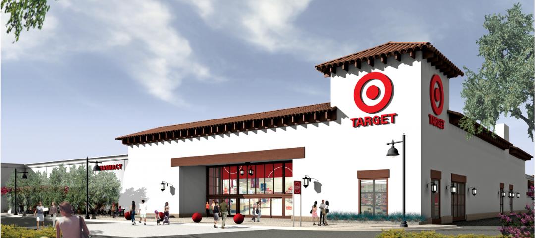
BIM on Target
By using BIM for the design of its new San Clemente, Calif., store, big-box retailer Target has been able to model the entire structural steel package, including joists, in 3D, chopping the timeline for shop drawings from as much as 10 weeks down to an ‘unheard of’ three-and-a-half weeks.

| Jan 7, 2011
How Building Teams Choose Roofing Systems
A roofing survey emailed to a representative sample of BD+C’s subscriber list revealed such key findings as: Respondents named metal (56%) and EPDM (50%) as the roofing systems they (or their firms) employed most in projects. Also, new construction and retrofits were fairly evenly split among respondents’ roofing-related projects over the last couple of years.
| Jan 7, 2011
Total construction to rise 5.1% in 2011
Total U.S. construction spending will increase 5.1% in 2011. The gain from the end of 2010 to the end of 2011 will be 10%. The biggest annual gain in 2011 will be 10% for new residential construction, far above the 2-3% gains in all other construction sectors.

| Jan 7, 2011
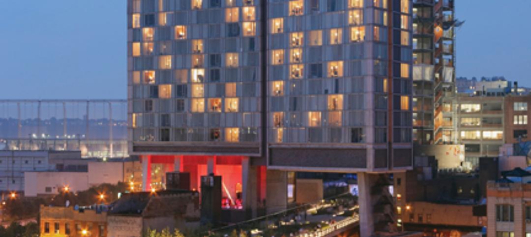
Mixed-Use on Steroids
Mixed-use development has been one of the few bright spots in real estate in the last few years. Successful mixed-use projects are almost always located in dense urban or suburban areas, usually close to public transportation. It’s a sign of the times that the residential component tends to be rental rather than for-sale.

| Jan 4, 2011
Product of the Week: Zinc cladding helps border crossing blend in with surroundings
Zinc panels provide natural-looking, durable cladding for an administrative building and toll canopies at the newly expanded Queenstown Plaza U.S.-Canada border crossing at the Niagara Gorge. Toronto’s Moriyama & Teshima Architects chose the zinc alloy panels for their ability to blend with the structures’ scenic surroundings, as well as for their low maintenance and sustainable qualities. The structures incorporate 14,000 sf of Rheinzink’s branded Angled Standing Seam and Reveal Panels in graphite gray.
| Jan 4, 2011
6 green building trends to watch in 2011
According to a report by New York-based JWT Intelligence, there are six key green building trends to watch in 2011, including: 3D printing, biomimicry, and more transparent and accurate green claims.
| Jan 4, 2011
LEED standards under fire in NYC
This year, for the first time, owners of 25,000 commercial properties in New York must report their buildings’ energy use to the city. However, LEED doesn’t measure energy use and costs, something a growing number of engineers, architects, and landlords insist must be done. Their concerns and a general blossoming of environmental awareness have spawned a host of rating systems that could test LEED’s dominance.
| Jan 4, 2011
LEED 2012: 10 changes you should know about
The USGBC is beginning its review and planning for the next version of LEED—LEED 2012. The draft version of LEED 2012 is currently in the first of at least two public comment periods, and it’s important to take a look at proposed changes to see the direction USGBC is taking, the plans they have for LEED, and—most importantly—how they affect you.
| Jan 4, 2011
California buildings: now even more efficient
New buildings in California must now be more sustainable under the state’s Green Building Standards Code, which took effect with the new year. CALGreen, the first statewide green building code in the country, requires new buildings to be more energy efficient, use less water, and emit fewer pollutants, among many other requirements. And they have the potential to affect LEED ratings.


