


Finishes investigations, which encompass the study of paints, glazes, clear finishes (varnishes, shellacs, lacquers) and their substrates, not only provide invaluable insight about early decoration campaigns but also help track the evolution, chronology, and alteration campaigns of a building. In coordination with a master plan for restoration, the historic color palette and patterns discovered inform the design and construction process and guide the selection of corresponding colors and patterns for new decorative and design elements. Finishes investigations can also include conservation cleaning tests of painted finishes as well as of wood, marble, stone, and metal features, for part of the value of an investigation is the determination of the historic relationship of the diverse architectural features.
Often clients will opt for minimal microscopy services to determine the dominant five or six historic paint colors, which are then applied broad-brush throughout the building. However, it is through archival research, chemical and mechanical exposures (also known as “windows” or “reveals”), and careful microscopic analysis of specific architectural elements that the relationship of interior features and the overall historic design can be best understood.
STEP 1. ESTABLISHING THE TARGET ERA
The first step in a finishes investigation should be the examination of archival information, if any exists. Newspaper articles heralding a building’s groundbreaking, or historic photographs capturing decorative ornament can not only provide details of original design and materials, but can also assist in the pinpointing of a building’s “target era” or “period of significance.” In the 19th century, for example, it was not uncommon to adorn the walls of a newly constructed building with a temporary finish. Once the plaster fully cured, this more basic design would be removed (in the case of wallpaper), washed off (in the case of distemper paints), or simply overpainted. Sometimes these initial decorative schemes were on display for less than a year, in which case the target campaign is actually the second decorative scheme; in other cases, the period of significance for the building dates far beyond the construction date. For example, if a prominent figure resided in a house, thereby imbuing it with landmark status, it is that period of residence that becomes the target era, not its original construction date.
Richard Upjohn’s Grace Church in Brooklyn Heights has four distinct periods of interest. Archival research, coupled with preliminary paint exposures and microscopy, helped outline them as follows: the 1848 construction and initial design; the 1866 polychromatic redecoration and installation of the first stained glass windows; the 1891 redecoration of the interior; and the 1909 structural and architectural alterations, which also included decorative repainting.
Based on initial information gathering, it was determined that the complexity and high style of the second campaign (1866) with bold and vibrant Gothic Revival decoration demonstrated the major period of significance for Grace Church—its “target era.” Findings from this campaign display intricate geometries and bold polychromies that draw heavily on British decorator A.W.N. Pugin’s 1840s pattern books. Pugin published a series of volumes of architectural and ornamental designs, most of which served as standard references for Gothic architecture into the 20th century. Motifs from Grace Church’s 1866 interior appear to have been copied directly out of Pugin’s classic sourcebook, Pugin’s Ecclesiastical Ornament (1844).
On-site investigation consisted of visual inspection of painted surfaces, extraction of samples from selected areas, and exposure of earlier decorative motifs. Sometimes, accretions of motif paints will telegraph through overpaints, and their outlines can be seen in raking light. Using the historic photographs and these ghosting patterns as guides, exposures of the 1866 target era campaign were created on the ceiling panels and beams, upper and lower wall fields, wainscots, and window surrounds.
A large exposure was created at the ceiling, revealing a vibrant pattern of stars and fleurs-de-lis executed in bright yellow, red, white, and tan on a bright blue field. The presenting faux bois ceiling decoration, composed of distemper paint, was water-soluble. Because the 1866 paints are well-bound oil paints that are not water soluble, overpaint removal and large-scale exposure of the 1866 scheme was a relatively quick and straightforward process.
Other sequences of overpaint, however, require far greater expenditures of time, chemicals, and mechanical effort. Fragility of any given paint layer (often due to binding media), adhesion between adjacent paint layers, and texture of a substrate are all factors affecting the difficulty of any given exposure. The textured plaster at the window returns required seemingly endless picking with a scalpel, digging overpaint layers out of the crevices. The results, however, were well worth the effort: the west window return revealed a boldly colored pattern consisting of a green field with a central blue fleur-de-lis motif, bordered by a red field with white flowers and yellow pin striping. Below that, an exposure at the dado revealed floral motifs that were similarly Puginesque and in keeping with the patterns found at the ceiling and window surrounds.
Below the dado, the wall was painted dark brown, presumably to complement or match the wood wainscot on the north and south elevations. Paint stripping at the upper wall masonry bracket indicated only a few layers of modern paint, suggesting that the brackets were originally unpainted. This led to the recommendation to strip the masonry brackets and restore their stone surface to its original intended bare appearance, so its natural texture and color could once again provide visual contrast with the vibrant designs of the adjacent painted surfaces.
STEP 2. DOCUMENTING PATTERNS, MATCHING COLOR
Upon exposure of historic decoration, patterns can be sketched or traced. Dimensions and color annotations are noted directly on the tracings, which can then be scanned, enlarged, and redrawn to create cleaner, more accurate copies of the patterns.
In situ color matching, however, is not always a reliable method of documentation. Colors can shift and fade during chemical exposure. For that reason, colors found on site should always be confirmed via microscopic examination of paint chips in the laboratory. At the Illinois State Capitol, in Springfield, patterns revealed in exposure were considerably paler and less saturated than the paints indicated in cross-section.
Samples collected for microscopic analysis should be removed from the soundest areas of accessible paint. The interior of each color layer is used for color matching, in order to minimize surface effects such as interaction with overlying dirt layers and medium migration within the paint layers. Under magnification up to 400x in daylight-corrected reflected light, the layering sequences of various areas are compared and analyzed in order to relate various historic paint campaigns and overall decorative schemes. Post-historic layers are typically given a descriptive color name, while historic layers are matched either in a commercial paint system (e.g., Benjamin Moore, Sherwin-Williams) or in the Munsell system, which identifies colors within a three-dimensional color space by describing the hue, value, and chroma.
The relative number and sequencing of layers can determine whether or not an element is original to the structure. For example, when examining samples from wood chair rail, if the adjacent wall sample contains 20 layers of paint while the rail sample contains only two, it is likely that the chair rail was a later addition. Similarly, very few paint layers on an exterior window frame typically indicate either that the window was replaced or that the wood was stripped prior to repainting.
With cross-sectional microscopy, decorative finishes such as glazes, marbling, or wood graining can often be detected. Aluminum, gold, silver, and composition leaf (a blend of zinc, brass, and copper, often referred to as “Dutch metal,” that mimics the appearance of gold leaf) can also be identified.
At the Loew’s Kings Theatre in the Flatbush section of Brooklyn, N.Y., our firm created exposures in multiple locations to reveal the gold and silver finishes original to 1929. Oxidation of metallic pigments and leaf, water damage, soiling accumulation, and extensive flaking and paint failure belie the true grandeur of the 1929 decoration. At first look, it seemed inconceivable that every surface was originally leafed, so massive is the interior. But after microscopic analysis of more than 150 samples, it was confirmed that the entire ceiling and the vast majority of wall surfaces in the 3,200-seat theater, as well as in its lobby and promenade, were originally finished with composition leaf, which was hand-burnished onto the surface and coated with amber shellac.
Drawing on the patterns and layout uncovered through exposure in conjunction with the colors and finishes found through microscopy, studio designers can create maquettes for each motif. Using these maquettes, they then produce renderings, which will display a unified design scheme for the interior.
More Scientific Tools that Can Aid Your Finishes Analysis
Additional analytical and testing methods can determine the composition of historic materials and refine the restoration scope.
- Solvent tests can be performed on site and are valuable tools in the determination of metal and wood finishes.
- Cleaning tests, inpainting tests, and consolidation tests can be performed at the same time as a finishes investigation and help in the development of specific treatments for conservation or restoration.
- Polarized light microscopy can be used to isolate and identify specific pigment or fiber particles based on their shape, size, refractive indices, and birefringent properties under cross-polar light, which can help in the dating process. For example, if you identify the white pigment in the first paint layer as titanium white, you can date the element (or paint campaign) to post-1917, when titanium white was first manufactured (though it was not produced in the U.S. until 1921).
- Ultraviolet light microscopy (UV) can help identify glazes and clear finishes.
- Fluorescent staining, Fourier transform infrared spectroscopy (FTIR), and gas chromatography–mass spectrometry (GC-MS) can assist in the identification of binding media and clear finishes.
STEP 3. DEVELOPING A UNIFIED DESIGN SCHEME
When the mosaic floor was laid in Grace Church in 1891 and the stained glass windows were installed between 1867 and the early 20th century, designers of these elements referenced and integrated colors and motifs from the 1866 paint campaign that persisted on the sanctuary walls and ceiling. As a result, despite the fact that Grace Church’s interior elements were altered at different times, the overall decoration was consistently presented as a unified whole, rather than as a piecemeal collection of divergent artistic styles and eras.
In much the same way that the patterns and motifs of Grace Church’s 1866 decoration were reflected in the design of the interior elements added during subsequent campaigns, so too was the 1866 color palette referenced and replicated.
Combining the archival and physical evidence, EverGreene designers work in tandem with the architectural team to produce new interior designs that reflect those of the target era. In Loew’s Kings Theatre, for instance, the historic color palette was used to select the colors for the newly designed drapery, stage curtain, carpets, and seating, as well as to determine appropriate levels of lighting. In this way, a building’s true form and intended appearance, often hitherto concealed above dropped ceilings and beneath multiple coats of overpaint, can guide a restoration program that is sensitive to the building’s history. BD+C
Related Stories

| Oct 16, 2014
Germany to commemorate Berlin Wall anniversary with 10-mile LED 'balloon' installation
The project, named Lichtgrenze (or Border of Light), makes for a colossal art installation dividing Berlin back to East and West. Eight thousand LED light-filled balloons, each 11 feet high, will line the path.

| Oct 16, 2014
Perkins+Will white paper examines alternatives to flame retardant building materials
The white paper includes a list of 193 flame retardants, including 29 discovered in building and household products, 50 found in the indoor environment, and 33 in human blood, milk, and tissues.

Sponsored | | Oct 16, 2014
Mill Brook Elementary School colors outside the lines with creative fire-rated framing solution
Among the building elements contributing to the success of the elementary school’s public learning areas is a fire-rated stairwell that supports the school’s vision for collaboration. HMFH Architects designed the stairwell to be bright and open, reflecting the playful energy of students. SPONSORED CONTENT
| Oct 15, 2014
Drones may soon assist code inspectors for construction in the UAE
The United Arab Emirates’ Ministry of Labour announced that they will start using drones to help inspectors record when construction sites are breaking laws.

| Oct 15, 2014
Harvard launches ‘design-centric’ center for green buildings and cities
The impetus behind Harvard's Center for Green Buildings and Cities is what the design school’s dean, Mohsen Mostafavi, describes as a “rapidly urbanizing global economy,” in which cities are building new structures “on a massive scale.”

| Oct 15, 2014
Final touches make 432 Park Avenue tower second tallest in New York City
Concrete has been poured for the final floors of the residential high-rise at 432 Park Avenue in New York City, making it the city’s second-tallest building and the tallest residential tower in the Western Hemisphere.

| Oct 14, 2014
Slash energy consumption in data centers with liquid-based ‘immersive-cooling’ technology
A new technology promises to push the limits of data center energy efficiency by using liquid instead of air to cool the servers.
Sponsored | | Oct 14, 2014
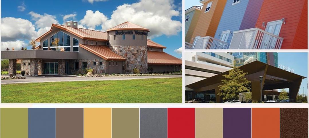
3 color trends drive new commercial exterior color collections
Collectively as a society, we help create color trends, which shape our businesses, recreational facilities, healthcare centers, and civic buildings. These iconic colors are now appearing in Valspar's new color collections. SPONSORED CONTENT

| Oct 14, 2014
Get inspired with the top 10 TED talks about cities
The TED talks, none of which are longer than 20 minutes, feature speakers such as architect Moshe Safdie, Rio de Janeiro Major Eduardo Paes, and animal behaviorist Amanda Burden.

| Oct 14, 2014
Proven 6-step approach to treating historic windows
This course provides step-by-step prescriptive advice to architects, engineers, and contractors on when it makes sense to repair or rehabilitate existing windows, and when they should advise their building owner clients to consider replacement.


