


Since the 1960s, residents of the Dutch city of Rotterdam have been bugged by an unsightly cigar shop on Coolsingel, one of its busiest streets.
Years passed, and the eyesore welcomed a new tenant, the U.S.-based fast food chain McDonald’s.
For 45 years, the branch continued to operate in the dated building until finally it received a much needed facelift earlier this year, designed by Mei Architects.
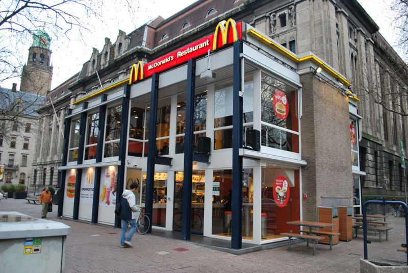 The original building
According to Dezeen, the original glass building, attached to a much older post office, was voted by Rotterdam’s residents as the ugliest structure in the city, and local officials were ready to demolish it. But McDonald’s still had 40 more years on the lease—the redesign route was taken instead.
"Since the 1970s the McDonald's pavilion has been altered frequently. Its quality suffered as a result, with its mostly closed facades. This makes the space anonymous. We want to activate this space again," the design studio’s founder, Robert Winkel, told Dezeen.
The resulting structure is a rectangular glass building with a perforated golden façade, and sleek, white grand spiral staircase. Etched to the façade is pixelated imagery of a crowd, responding to the restaurant’s bustling site. The new building was also detached from the post-office, making it seem more like a pavilion.
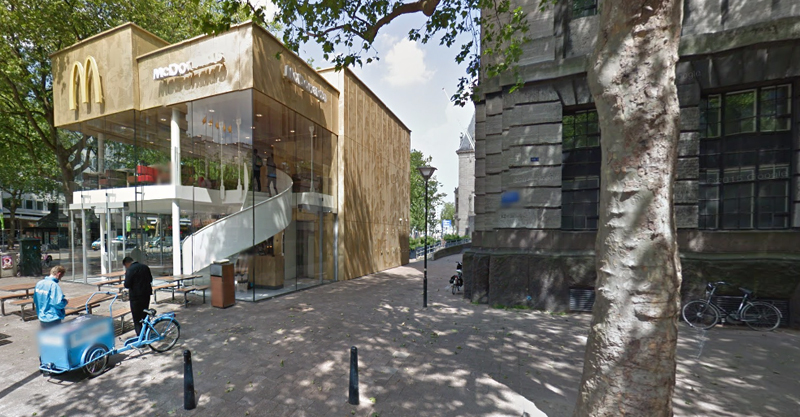 The building is now separated from the much older post office edifice, making the restaurant more like a pavilion. The golden perforated panels depict a pixelated image of a crowd.
Transparency was a key concept in the design. The color-to-ceiling window idea from the original building was kept.
"The transparency and openness, as well as the depicted crowd on the facade panels, emphasize that McDonald's is for everyone, for every Rotterdam resident," Mei Architects' Marloes Koster tells AdFreak.
Onlookers can glimpse into the kitchen as well as get a hint of the grand staircase. By day it reflects sunlight, and the building maintains its glow when sun falls.
"As McDonald's is open day and night, 24/7, its appearance after dark is important," the team told Dezeen. "By day the building is inviting to shoppers, while in the evening it glows to attract the nightlife crowd."
AdWeek reports that the building won an Iconic Award 2015 prize for excellence in architecture and design.
Related Stories

| Apr 29, 2014
Best of Canada: 12 projects nab nation's top architectural prize [slideshow]
The conversion of a Mies van der Rohe-designed gas station and North Vancouver City Hall are among the recently completed projects to win the 2014 Governor General's Medal in Architecture.

| Apr 29, 2014
USGBC launches real-time green building data dashboard
The online data visualization resource highlights green building data for each state and Washington, D.C.

| Apr 11, 2014
First look: KPF's designs for DreamWorks in the massive Shanghai DreamCenter
Two blocks of offices will be centerpiece of new cultural and lifestyle district in the West Bund Media Port.
 in progress. For additional technical infor")
| Apr 9, 2014
Steel decks: 11 tips for their proper use | BD+C
Building Teams have been using steel decks with proven success for 75 years. Building Design+Construction consulted with technical experts from the Steel Deck Institute and the deck manufacturing industry for their advice on how best to use steel decking.

| Apr 8, 2014
Gehry, Foster unveil plans for Battersea Power Station redevelopment [slideshow]
Phase 3 of the massive redevelopment of the London landmark will include more than 1,300 residential units, a 160-room hotel, and 350,000 sf of retail space.

| Apr 2, 2014
8 tips for avoiding thermal bridges in window applications
Aligning thermal breaks and applying air barriers are among the top design and installation tricks recommended by building enclosure experts.
| Mar 26, 2014
Callison launches sustainable design tool with 84 proven strategies
Hybrid ventilation, nighttime cooling, and fuel cell technology are among the dozens of sustainable design techniques profiled by Callison on its new website, Matrix.Callison.com.

| Mar 20, 2014
Common EIFS failures, and how to prevent them
Poor workmanship, impact damage, building movement, and incompatible or unsound substrate are among the major culprits of EIFS problems.

| Mar 20, 2014
D.C. breaks ground on $2B mega waterfront development [slideshow]
When complete, the Wharf will feature approximately 3 million sf of new residential, office, hotel, retail, cultural, and public uses, including waterfront parks, promenades, piers, and docks.

| Mar 12, 2014
14 new ideas for doors and door hardware
From a high-tech classroom lockdown system to an impact-resistant wide-stile door line, BD+C editors present a collection of door and door hardware innovations.


