KFC opens urban prototype in the Bronx
By David Malone, Associate Editor
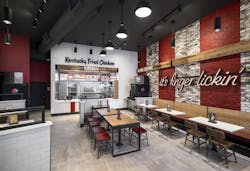
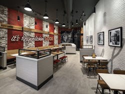
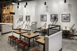
Located in the Bronx, KFC’s new urban inline restaurant design reflects the borough’s fast-paced, eclecticism with bolder accents and unique features evolved from the brand’s traditional American Showman restaurant design.
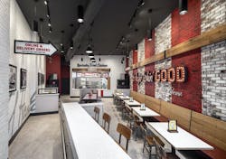
The project’s overall aesthetic reflects a juxtaposition between Colonel Sanders-inspired hospitality and the hustle and bustle of the Bronx. Upon entering the building, guests are greeted by a large Colonel Sanders wood focal wall and signage that features the brand’s “it’s finger lickin’ good” tagline. A brick accent wall serves as the backdrop for KFC’s signature red stripes to create a beacon visible from both the inside and the outside.
“Working with a brand historically known for its southern hospitality, we created a design that maintained the iconic experience, but also looked to fold in a distinctly edgier attitude to deliver on the feistiness of what guests see from KFC in commercials and on social media.”
See Also: World’s first drive-thru only restaurant in Australia
The seating arrangements and ordering options were designed for the on-the-go mentality of New Yorkers. The restaurant has bar seating for solo diners and a designated pick-up area for mobile and to-go orders.
The design gives the brand a modern look that captures the Colonel’s vintage flavor and marks a continued strategy to create more alternate and non-traditional formats that connect KFC with its consumers in differentiated markets.


