Inclusive design for locker rooms: Providing equitable choice and access
What would it look like if everyone who wanted to use a restroom or locker room could? SRG designers posed this question, and I joined the conversation to learn about the design process. The initial research regarded the history of public facilities and current iterations. Despite the ubiquitous human need for cleaning, grooming, and eliminating, who is served by public facilities and who is not often stimulate anxiety, debate, and conflict in the United States.
The current state of American public restrooms reflects how marginalized groups have advocated for inclusion in mainstream society. Civil rights movements led to improving access by creating Ladies’ Rooms to accommodate women in the workforce, desegregating bathrooms, challenging irrational fear of shared spaces with gay men during the HIV/AIDS crisis, and expanding accessibility through the Americans with Disabilities act.
Thanks to these activists, American restrooms have gotten better over the past 150 years, but many people are still excluded, because these facilities still don’t suit everyone’s needs:
- Transgender, non-binary, and gender non-confirming individuals
- Families who need diaper changing facilities, access to lower sinks for children’s handwashing, and/or to chaperone older children who still need assistance
- Caregivers who provide physical and medical assistance and are a different gender from the care-receiver
- Overlooked ADA challenges like sink heights and wet counters that drip in wheelchair users’ laps
- People with medical conditions (such as urinary problems and autoimmune diseases)
- Paruresis and parcopresis (phobias of public toilets)
- Religious people seeking ablutions (such as foot-washing) before prayer
- Overloaded lines for one gendered room while the other is underutilized
How can these spaces be safe, efficient, and provide the greatest value for all users?
The current inclusivity solution is to maintain exclusive Men’s and Women’s rooms while occasionally providing a separate, single-occupancy room to accommodate all “others.” This is not exactly a thoughtful design and doesn’t go far enough to solve the problem of access. While it’s better than nothing, it further stigmatizes anyone who’s not accommodated by existing facilities by sending the message: you don’t fit in here, so go over there, or just go away.
Inclusive restrooms and locker rooms are a hallmark of human-centered design. Due to stigma and complacency, these spaces have been an overlooked design opportunity. The groundbreaking work at Stalled! is an inspiring stride to transform the status quo of public facilities.
The team at SRG focused their attention on reimagining how locker rooms can better support users.
- Respectively, women’s and men’s locker rooms don’t offer many amenity differences, making them ideal to consolidate
- Locker rooms are complex: toilets, showers, changing rooms, and personal secure storage
- Locker rooms are social environments where families and friends mix before engaging in recreational and fitness activities
How can locker room design create an environment that supports human health and vitality?
At the collegiate level, integrating gender inclusive locker rooms has been gaining traction. It stands to reason as various collegiate facilities have been gender-neutral for many years, such as restrooms in residence halls. A standard design that’s emerged is a central bank of lockers, surrounded by private toilet, shower, and changing rooms.
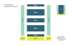
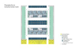
The team inverted this concept by centralizing the private zone and locating shared space along the sides, lining up with entrances and exits. This strategy presents many opportunities to balance shared and private zones and increase efficient use of the space.
A scalable, modular approach
The layout is built on a scalable, modular approach. The modules are stackable, so the selection of private rooms can be scaled to specific user groups and space constraints, and rows can be lengthened or added.
This layout can be tailored to various facilities like collegiate facilities, but also community centers, private gyms, and corporate environments.
Efficient adjacencies
A highlight of SRG’s model is that lockers have close adjacencies to the central bank of private rooms. Each row of private rooms offers a variety of toilet, shower, and changing rooms, so a user doesn’t have to walk all around the locker room to access the amenities they need. After a user enters the facility and selects a locker, they have access to the central core to wash hands at the sink or utilize a private room.
Many traditional locker room designs compartmentalize amenities: bathrooms in one section, changing rooms and showers in another, vanity counters and mirrors in yet another, etc. This concept to cluster activity zones can decrease efficiency by making it necessary for users to move around the entire room to use each amenity and inevitably leads to overcrowding zones during rushes.
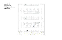
Imagine an aerobics class of fifteen students in SRG’s locker room concept. Everyone will arrive at approximately the same time and follow the same general cadence of using a changing room, locking up personal items, using a toilet, washing their hands, and then the reverse after class finishes and they prepare to leave the locker room. Additionally, they won’t be the only user group in the locker room. In a typical design with grouped amenities, this causes crowding at nearly every step (not enough space in front of the lockers, a line for the toilet, congested pathways as people pause to socialize, and so on.)
SRG’s concept encourages people to spread out, because all lockers have convenient access to the central private zone users need for toilets, showers, changing rooms, and sinks. This innovative layout can positively impact overcrowding during rush times due to equitable choice and access as you can see from the diagram below which illustrates 40 people easily mingling in the shared facility.
Privacy
A nuance to this design is creating a sense of privacy even in a shared space with high visibility. In a locker room surrounded by private rooms that open-up directly into the shared area, when a user enters or exits a toilet room, they do so on display to everyone in the room.
By placing the private zones within corridors, even though they still have a high degree of visibility, a user doesn’t feel like they’re walking directly from a toilet room into a large, shared space full of people. The circulation space in the private zone adds subtlety to a shared space while still preserving user choice, flexibility, and overall visibility.
Social connection
Another consideration was how a locker room can integrate into the social fabric of a building. The long circulation routes could connect the locker room to amenities throughout the building as opposed to being a closed off room. For example, the locker room could be a connective pathway between a pool room, a cafeteria, multipurpose rooms, meeting rooms, gymnasiums, and workout rooms. Passing through the locker room can be an integral part to how users interact with the building and further enhance the sense of shared space.
To emphasize this opportunity, the designers added a communal space at one end of the floorplan. It acknowledges that fitness facilities fill an important social role, and the design encourages efficient use of locker facilities by designating a cohesive gathering zone.
This design concept was a reimagining of the locker room experience but without a particular client or a specific location in mind. It’s a conceptual approach that starts to answer the question stated at the top of this essay: What would it look like if everyone who wanted to use a locker room could? It would look open, efficient, safe, and dignified.
The designers I worked with for this project were passionate and curious problem-solvers, and they recognize when standards are insufficient. When I first joined the team, what I couldn’t imagine as possible for locker room design was effectively re-imagined and continues to be internally iterated upon. This process has reminded me that when we prioritize human-centered design, we can learn to expand our expectations beyond the status quo.


