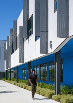
S.M.A.R.T. campus combines 3 schools on one site
From the start of the design process for Santa Clara Unified School District’s new preK-12 campus, discussions moved beyond brick-and-mortar to focus on envisioning the future of education in Silicon Valley. For months, designers worked with educators, parents, students, trustees, local industry leaders and researchers to explore the continuum of learning for students in their California community.
“This campus is the result of a very invested community coming together to define what their future would look like,” LPA Director of K-12 Kate Mraw says. “They weren’t trying to set the tone for the future of schools across the country; they were trying to define what learning looks like here in Santa Clara USD.”
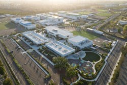
The district, which hadn’t built a new school in years, was seizing the opportunity to add comprehensive elementary, middle, and high schools on a single 55-acre site in a sprawling metropolitan area of San Jose. The location was the former home of Agnew Developmental Center, a mental hospital that closed in the early 2000s, and neighbors the site of a future city park.
Each of the schools on the Agnew campus would maintain their own identity and learning goals. But the shared site created a rare opportunity for the district to provide students consistency and a common experience as they matriculate through their education, from school to school. For many elementary school students, Agnew will be the only academic environment they know. The campus developed as a study of the district’s preK-12 curriculum, along with the different ways facility design can support teaching and learning at each level.
“The density and adjacency of the three schools was an opportunity to create more connections between the schools,” says LPA Design Director Helen Pierce. “The educators saw the potential to link how they teach and what they teach, and opportunities for students to mentor each other.”
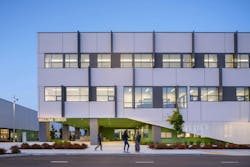
The final campus is a cohesive facility with a common language and vocabulary, but with a scale and identity unique to each school. The primarily one-story, 56,700-sf Abram Agnew Elementary School steps up to the two-story, 103,600-sf Dolores Huerta Middle School, leading to the three-story, 192,200-sf Kathleen MacDonald High School, which serves 1,600 students.
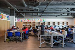
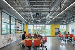
Each campus features STEM and co-lab spaces appropriate to the grade levels. Collaborative areas and outdoor learning spaces are aligned to the specific developmental age of the students from school to school, creating student-centric spaces to support the different levels of learning.
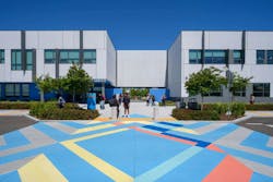
Throughout the campus, outdoor spaces were treated as extensions of the indoor learning environments, accommodating flexibility and personalization. Each school wraps around an exterior quad with its own distinct identity referencing the local environment. The elementary school pays homage to the grasslands, the middle school highlights the oak woodlands, and the high school references a mature redwood forest.
Guiding Principles of Campus Design
During the programming process, discussions often focused on developing a balance between the traditional and transformational, searching for what was appropriate for Santa Clara USD. The discussions recognized that designs in other districts might not be appropriate for the new Agnew schools. Wayfind Education founder Julie Zoellin Cramer joined key workshops, sharing research illustrating the potential outcome-based impacts of different environments.
“A big part of the process was understanding where they were on a continuum from traditional to transformational and defining where the educators wanted to get to,” Mraw says. “The learning experiences for their students and their district were very unique and very specific.”
Based on input from educators, industry leaders and the community, the campus was developed around a set of guiding principles dubbed S.M.A.R.T.—Sustainable, Mindful, Adaptable, Relevant, and Transformational. Those principles informed every aspect of the design, including the development of a master plan for the site, which focused on developing connections and shared efficiencies between the schools.
The site of the former mental facility presented several challenges for the district and LPA’s integrated team of engineers, interior designers, and landscape architects. High-voltage lines run along the western property line; no program elements could be placed under the towers. A nearby cogeneration plant further limited the use of part of the property.
On the remainder of the site, each campus and quad would need to address codes for fire and public safety access, as well as provide space for deliveries and other critical functions. Each campus would also need dedicated parent drop-off zones.
“I like a good puzzle, and this had a lot of puzzle pieces,” says LPA landscape architect Rita Frink.
Agnew is designed as a cohesive campus with a common visual language, but with scale and identity unique to each school. The process established efficiencies in the combined campus. Department heads at each level were able to share their needs and approaches. Clustering the structures and building vertically preserved open space and maximized opportunities for shared facilities—a media center is used by the middle and high school; the middle and high schools share a kitchen; faculty share an outdoor lounge area; and the performing arts center is used by all the schools. The elementary school was the first to be built, and designers were able to learn important lessons from the experience.
“By staggering the projects, we were able to carry the lessons learned from the elementary school into the remaining two projects,” says LPA Studio Director Dave Eaves. “We invested a lot of effort collectively in the elementary school, and then we reaped the efficiency rewards on the middle school and the high school.”
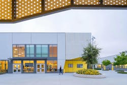
There is a consistency to many elements of the campus. In addition to each school being developed around an open quad, a promenade connects the elementary and middle schools to the high school. Usable outdoor spaces and exterior dining are part of each school. Wayfinding and the color palette, although unique to each school, reference the grassland, woodland and forest themes, helping to tell a consistent story throughout the campus. (And each school has a bird for a mascot.)
But there are clear delineations between the style and scale of each campus. The grounds take on different forms as students progress from one level to the next. The elementary school is full of simple circular forms and arcs; the middle school expands to ellipses and more complex shapes; the high school is defined as more angular, reflecting the more complex needs and learning levels of the older students.
The elementary school courtyard is more protected, located close to the classrooms; the middle school spaces reflect more socialization, outdoor learning, and social and play spaces; the high school environment supports students’ growing independence, with small group spaces and more complex and interactive learning environments focused on career tech.
“It’s a continuum of features but unique in the way that each of those are articulated and how they align with the curriculum happening at each level,” Mraw says.
Each campus is scaled and designed to support students at that particular level. The adjacencies promote mentorship opportunities and the ability to pollinate pedagogies and ideas across teaching staffs. Learning spaces were designed for flexibility and adaptability to changing needs—core elements of the S.M.A.R.T. approach—but were always focused on the district’s goal to develop “resilient, future-ready, lifelong learners who think critically, solve problems collaboratively, and are prepared to thrive in a global society.”
Creating Outdoor Connections
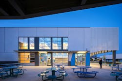
Outdoor spaces on the dense campus are linked to the interior spaces and the learning goals. Exterior maker spaces are equipped with power and concrete slabs that can be used as workstations or seating. Social spaces double as educational environments, depending on teachers’ needs. The high school offers a variety of active spaces, including terraced seating, an open lawn and a basketball court.
LPA was hired to develop the interior and exterior furniture package, which emphasized seating and work surfaces of the appropriate scale that could serve multiple roles.
“We chose a color palette that worked with each school that was identifiable,” Frink says. “And we wanted to make sure everything could serve dual purposes—if there was a dining table, the table surface needed to be solid, not perforated, to allow students to write and do schoolwork as well.”
Each campus has its own garden, maintained by students, located along the pedestrian spine that connects the different campuses. “It was another opportunity to put an educational component on display,” says LPA Director of Landscape Architecture Kari Kikuta. “It provides a connection between the three campuses. Everybody can see each school’s garden.”
Outdoor spaces are also linked with the campus’ sustainability design. Gardens located adjacent to the middle and high school kitchen and culinary arts program space are used to grow food that is prepared by students as part of their education. The integrated design highlights native, low-water-use plantings; stormwater is captured in the quads and other areas and treated in basins on site before circulating to the municipal stormwater system, providing a teaching tool for sustainability.
The campus was designed to meet Collaborative for High Performance Schools (CHPS) standards, which focus on environments that support learning and wellness. The design emphasizes passive strategies—siting, orientation and massing—to maximize daylighting and views while minimizing energy loads. Interior strategies focused on sustainable materials and improved indoor air quality.
A Commitment to Students
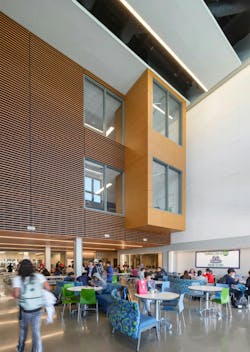
Several spaces stand out on the campus, now that all the schools are open. The student union is an active hub, including food services, gathering spaces and the ASB home. The media center, used by the middle and high schools, provides opportunities for different types of collaborations and cross-campus links, exposing younger students to the high schoolers’ world.
From the start, designers were focused on the unique opportunity to create a campus that would serve students through their preK-12 years.
“We wanted to give them a sense of achievement and progression through those potentially 14 years at this campus,” Pierce says. “It was really important to be demonstrative of that progression.”
The campus also reflects the district’s commitment to evolving its curriculum to fit the needs of the community and the evolving students. The schools provide a balance of arts and technology, giving users the chance to explore and learn, with so many easily accessible facilities. By the time they reach high school, students will be prepared as lifelong learners to take the next step.
“This is a campus designed to support students in their future careers, whatever that might be,” Mraw says. “It was important to give them space to be themselves and figure out where they belong in this world.”
About the Author
LPA
LPA believes that sustainability inspires great design—design that’s environmentally intelligent and efficient—yet also visionary, vibrant and life-changing. From K-12 and higher education facilities to civic, recreational, corporate and healthcare developments, LPA delivers design solutions that benefit the environment, improve the bottom line and enrich the human experience. Visit LPA's Insights page for more blog posts. Follow us on Facebook, Instagram, LinkedIn, Twitter, and YouTube.


