How computer simulations of vision loss create more empathetic buildings for the visually impaired
More than 2.2 billion people in the world are visually impaired, while at least half of these cases—1 billion— could have been prevented or have yet to be addressed. In addition, blindness is expected to double in the U.S. by 2050 due to chronic diseases, like diabetes. For children and adults alike, loss of vision has significant effects on daily life, from accomplishing day-to-day tasks like reading and learning, to overall quality of life and mental health.
To fight against vision loss—and end preventable blindness—the new Oregon Elks Children’s Eye Clinic at the Casey Eye Institute in Portland, Oregon, includes a pediatric eye clinic, as well as centers for retina services, vision rehabilitation, ophthalmic genetics, age-related macular degeneration and clinical trials.
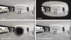
When it came time to design the clinic, the NBBJ team first shadowed patients and interviewed staff about diagnostic conditions in collaboration with OHSU and Casey Eye Institute researchers. The team then used this research to develop custom simulations early in the process that allowed them to input a specific eye condition and then view proposed designs through that lens.
For example, the models simulated what clinic spaces would look like to young patients with cataracts, diabetic retinopathy and glaucoma, as well for older adults with age-related eye conditions such as macular degeneration. Together, these research techniques were essential to support an empathetic design process that resulted in targeted design solutions to create an intuitive and visually comfortable environment.
Here is a look at four challenges identified from our research and how the design responds accordingly.
Difficulties with Low-Contrast Colors
Challenge: While patients with macular degeneration, diabetic retinopathy and low vision have different vision conditions, a heightened sensitivity to low-contrast environments is a common challenge. This means greater difficulty in visually distinguishing colors that are next to one another on the color wheel, or different tints, tones or shades of colors. For example, combinations of red and orange, blue and purple, or dark green and light green, can be more difficult to differentiate for these young patients.
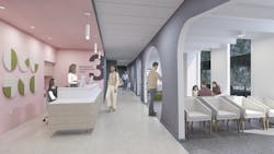
Solution: Enhanced Contrast. To improve navigation and orientation, the clinic utilizes high-contrast materials and colors. For example, design elements like rubber flooring and tile transitions are exaggerated with contrasting colors and textures to distinguish walkways from seating areas. In addition, public spaces such as elevators and bathroom doors are lighter in color to adjacent dark walls, signaling a destination or a public path of travel. Meantime, exam room doors are further accentuated with contrasting, built-in “door mats.” Furthermore, in the entry lobby the greeter desk is cloaked in a high-contrast color, which enhances visibility. The desk also anchors the space with an integrated guide rail that low vision patients can use to navigate to the elevators around the corner.
Unclear Signage
Challenge: Navigating the existing clinic was difficult for patients, and it was especially challenging to find the bathroom among a sea of white doors and walls. Patients struggled to read signage and would frequently ask passersby for directions to or assistance with the elevator.
Solution: Bold Graphics. To improve visibility for patients, especially from a distance, signage throughout the clinic is large and high contrast, while graphics and numbers are bold and distinct. For instance, the optical shop showcases a feature wall, which hosts a welcoming mural with the clinic’s friendly “Casey” mascot, that can be seen from the lobby. A frit pattern on the shop’s glass storefront also helps to indicate the glass enclosure as a barrier and guide patients to the shop entry.
Light Sensitivity
Challenge: The team found patients whose eyes were dilated for their exam waited with their heads between their legs to shield their eyes from daylight and stark white walls.
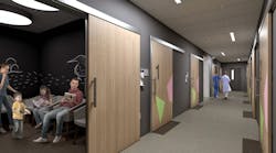
Solution: A Customizable, Calming Oasis. To provide a soothing, choice-driven experience for patients dilated during their visit, the new clinic features quiet spaces with dimmable lighting. For instance, sub-waiting zones in the children’s exam corridor are programmed with adjustable light settings and gentle, darker colors. Unlike the typical clinic, daylight is minimized throughout and limited to primarily public and staff spaces. The team considered acoustics as well, as patients with eye conditions and patients undergoing dilation can be more sensitive to sound. Playful acoustic panels in sub-waiting zones and in the cafe are inspired by ophthalmological “visual field” diagrams provided by OHSU. Seating areas also feature a dividing wall that creates quiet and active zones, and even hosts a whimsical child-sized opening for young patients to explore.
Wayfinding Issues
Challenge: The existing clinic lacked a sensory-rich arrival experience to help orient and calm patients, so it was key to create a welcoming entry sequence that offers both a sense of inviting familiarity as well as engaging novelty.
Solution: Textural Variety. A restorative garden adjacent to the clinic drop-off encourages a multi-sensory experience for young patients and their loved ones via textural changes and a tactile wall. Landscape elements were also selected to build on other senses in lieu of vision. The garden includes a diverse array of fragrant and tactile plants to provide sensory interest—as well as welcoming familiarity—throughout the year. In addition, the team removed all vertical exterior pathway elements such as signs and bollards to create a barrier-free entry, while materials were specified to enhance visibility. For instance, the project uses a darker than typical sand finish to reduce glare and light levels for patients.
By designing with empathy grounded in research that considers the unique needs of people with eye conditions, we can help our clients better care for patients as individuals—and provide a welcoming and safe space to support them—by first seeing the world through their eyes.


