Color Me Trendy—How Color Highlights Importance in the Built World
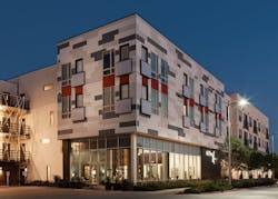
Photo by Steve Hinds, Steve Hinds Inc.
Color has long been a way of expressing details and emotions, and capturing one’s attention.
While neutrals are universally beloved, as of late, trendy pops of color have been garnering people’s interests and making a splash on exterior surfaces. As 2017 kicks off, neutrals will still have a fond place on the color trends lists, but architects and builders have decided that pushing the color envelope has become the new trend for them.
Some of the trendy colors for 2017 have taken on a darker hue—like Farrow & Ball suggestion Studio Green and Benjamin Moore’s Shadow 2117-30—while others, such as Pantone’s Greenery and Sherwin-Williams’ Poised Taupe, stuck with the neutral palette.
Where do these trends originate? Several institutions, like Pantone Color Institute, announce color trends and colors of the year, drawing on worldwide trends before selecting a main color for the year with subsequent shades for the season. The color of the year not only follows trends from around the world, but sentiments as well.
Take Dulux for example. It’s 2017 color of the year is Denim Drift, described as a smoky, calming gray-blue. Why blue? The company states that blue is the color of consumers every day: the color of the sky, the color of jeans. Blue can also be a feeling.
Many think of trendy things as the “here and now,” but color forecasters predict hues that will be popular for the next several years. Some manufacturers draw on feedback from surveys, while others rely on color consultants or in-house color experts to help them pick the perfect hue.
Once trends are released, companies, consumers, architects, and contractors have a plethora of options for selecting new colors for projects in literature, social media, and so forth. In the built world, architects are finding that it still takes a little bit of shove to get consumers to push that color envelope—remember the preference for neutrals.
“A lot of times we run into that problem,” says Michael Smith, Senior Designer at Humphreys & Partners Architects. “We will suggest a color and the owner will admittedly really like it, but we still have to convince them to actually use the color because they are worried about what the [end-user] is going to think.” Smith says they advise clients about the benefits of getting over that hump by, and explaining that if a bold choice is made with color, it will help the project, not deter it.
“We have seen that mainly on more contemporary or modern projects, where you want that bold color because it’s what draws them in,” he explains. “We want it to have that pop, we want to have that color splash.”
Most designers or builders will say that they want people to be drawn to their building—even frequent the building—when they otherwise might have walked right past it. “Owners are starting to look for places where we can add color versus before, where we had to suggest it,” Smith says.
Many firms also say that they don’t follow the color trends from year to year, and tend to stay on the cutting edge of the trends. “We are actually trying to be trendsetters,” adds Smith.
Karen Quinn, Project Architect at The Boudreaux Group, echoes Smith’s sentiment, saying her firm tends not to stick to certain color trends. “We try to work from the indigenous location of the project,” Quinn says. “We are usually referencing (especially for exteriors) other ideas and generations that help us pick colors for the building.”
DSGW Architects doesn’t follow color trends either, more so taking the approach that Quinn’s firm has. “We work toward trying to fit within the context of the area, rather than closely following or adhering to a trend,” says Principal John Erickson. Erickson also feels that following trends happens more in the interior application realm versus exterior.
Chris Dufreche, Associate AIA | JHP Architecture / Urban Design
Jonathan Brown, Senior Associate at JHP Architecture, is known for pushing the color envelope at his firm. “With any design element in the building, we like to have a reason behind it,” he explains. “More than just doing whatever everyone else is doing, or replicating what we are seeing in magazines.”
Color inspiration for Brown comes from local aesthetic and the environment surrounding a project. “We come up with a design direction that helps guide us through a process, rather than copying or being too trendy,” he says.
That being said, his firm does a lot of research, sometimes utilizing social media as a tool. Brown says he gets inspiration from RoseArt’s colored pens and coloring books for kids. “Color is a visual language when it comes to design, but it can often be misused by emphasizing the wrong things,” Brown explains. “Color for architects is about giving emphasis.”
Brown feels that rather than just drawing people’s attention, color needs to be there for a reason.
“If you saw a building with a vertical tower and a lot of color, you would assume you are supposed to do something there,” he says. “If you have some neutral colors that make the building sit in its site nicely, but then you have some red or yellow that pops [situated] where you enter the building it becomes a visual language that the user understands.”
Colors can evoke feelings, memories, or even a sense of being in the right place. Whether you follow trends or not, placing the correct color on a building can make all the difference in the world.

