Latest Trends Driving Color Selection and Upping Curb Appeal
Color trends are important for many involved in the building industry, from paint companies and manufacturers to the architects and designers who specify coating products for the built environment. Thankfully, there are many resources available to make the selection of colors quicker and easier for those making the recommendation.
In addition to annual trend forecasts that deliver information about which colors are on the rise and where they will be seen, specific sectors are driven by the demands of their client base. Here is more information on various color trends and client demands:
In a similar vein to current trends in residential construction, multifamily is seeing many changes being directed by consumer preference. Builders are adding to formerly limited color palettes for exteriors, embracing neutrals and other hues. “They understand that they can create great curb appeal for communities and use color selection strategically as a competitive edge for both them and multifamily property owners and managers,” says Sue Wadden, director of color marketing for Sherwin-Williams.
For example, many residential designers typically focus on a project’s interiors, helping homeowners select finishes and colors, Wadden says. Now multifamily property managers have hopped on board, offering tenants more options. Offering color selection for a feature wall can allow for more choices in a living environment and add revenue from a prospective tenant. In some cases, it can pay $25 more per month from a tenant who picks a color on a select wall in their apartment.
“What that’s doing is creating a sense of space,” Wadden says. “Attrition rates on rentals have positively been affected by that—tenants tend to stay longer when it feels like home. Plus, they have to appeal to millennials who are a generation that has seen a lot, and they have pretty discerning taste—and curated color palettes and interesting selections in color provide a great way to do just that.”
While Wadden says trends are key, she feels what’s most important—and what transcends the cycle—is having a complete color system. The ColorSnap® system from Sherwin-Williams, for example, comprises 1,500 colors, and as trends change over time, the system has all the colors that make up macro trends. “Year to year, we can pull from this master palette and talk about trends as they relate to what’s going on in the world,” Wadden says.
And just as important in the system are the tools that help professionals confidently select a color, with less time, and the technology that ensures they’ll get the exact color they selected every time they go to purchase it, a key piece for any future touch-ups.
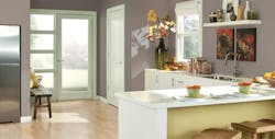
As much as trends have evolved the built world’s color spectrum, one group that pops up in all color palettes is neutral. The gray universe that the color market lived in is now shifting to warmer neutrals, which is perfectly demonstrated in Sherwin-Williams 2017 Color of the Year, Poised Taupe.
“Neutrals have consistently been the most popular colors over a 20-year span,” Wadden says. “We saw Spa Blue come in and out maybe 10 years ago, and consumers expressed interest in purple tones, but it’s nowhere near the percentage of uses that we have in neutrals.”
Whether it’s whites and lights or midtones, or deep dark charcoals and richer neutrals, neutrals are the North American color preference, Wadden says.
In case you missed them, check out part one and part two of this exclusive series.

