Bringing Comfort to Patients and Families Through Uses of Color
Bringing Comfort to Patients and Families Through Uses of Color
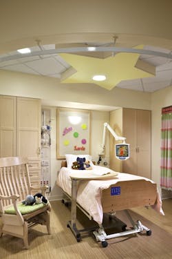
In children’s hospitals, patients are of the younger, brighter variety, and healthcare designers are often tasked with the mission of creating environments that are colorful, bold, and engaging so that patients and their families are completely comfortable during their stays and understanding of the difficult processes that may be happening around them. Combinations of color, lighting, and texture are used to set the tone for spaces such as waiting rooms, patient rooms, and more. Wayfinding is another important aspect that is carefully crafted with the selection of color in children’s hospitals. And with the perception of color still developing as children age, design teams should be mindful of the best hues to employ when envisioning these spaces.
The following are just a couple examples of how colors are selected and used in children’s hospitals today:
Dayton Children’s Hospital
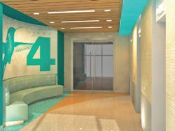
FKP Architects’ work on the new 260,000-sf patient tower at Dayton Children’s Hospital in Dayton, Ohio, is designed to reflect the city’s history of aerospace and invention, with colored iconography employed to create an easy flow between the existing and upcoming buildings (pictured, left). “Playful colors were selected that were fresh yet distinctive. Combinations of color and iconography strengthens the concept,” says the firm.
In the new tower, floors that connect between buildings maintain the same color palette to maintain consistency and avoid confusion. As occupants go up, they find certain colors such as green and purple associated with symbols of flight, such as an airplane and hot air balloon, respectively. The combination also allows for people with red-green color blindness to follow the wayfinding patterns set out.
Elizabeth Seton Pediatric Center
The Elizabeth Seton Pediatric Center in Yonkers, N.Y., is a nursing facility for young patients, many who are non-communicative and immobile without some type of aid such as a wheelchair. These patients are also often vision-impaired, and so the design of the center focused in on their perception of color, lighting, and texture. Color theory helped guide many of the design decisions, according to David Hutchinson, AIA, associate principal at Perkins Eastman, who incorporated colors to accomplish therapeutic effects for the project.
The strategy is aimed at helping children understand and communicate with their surroundings. “For instance, as yellow is the first identifiable color by an infant, the babies’ floor emphasizes yellow. And as violet is the last identifiable color by a child, the older children’s floor emphasizes violet,” says the firm. “Upon entering the main lobby, these colors progress through the spectrum, from front doors to elevators and up to the floors, and even the ceilings.”

