HEALTHCARE GIANTS: Age-simulation technology aids design for the mobility impaired
By 2030, a fifth of the U.S. population will be 65 or older, according to the Census Bureau. This cohort and succeeding generations are expected to live longer than their predecessors, and remain much more active into their later years.
TOP 90 HEALTHCARE ARCHITECTURE FIRMS
Rank, Firm, 2015 Revenue
1. HDR $189,259,600
2. Stantec $169,505,425
3. Perkins+Will $147,640,000
4. HKS $134,427,510
5. CannonDesign $130,000,000
6. SmithGroupJJR $80,272,000
7. NBBJ $80,000,000
8. CallisonRTKL $69,955,000
9. HGA $67,221,000
10. HOK $59,887,000
TOP 100 HEALTHCARE CONSTRUCTION FIRMS
Rank, Firm, 2015 Revenue
1. Turner Construction Co. $2,013,969,043
2. McCarthy Holdings $974,575,751
3. Skanska USA $909,329,296
4. Brasfield & Gorrie $889,780,920
5. JE Dunn Construction $775,645,914
6. DPR Construction $752,608,000
7. Robins & Morton $629,700,000
8. PCL Construction Enterprises $612,506,352
9. Whiting-Turner Contracting Co., The $536,246,481
10. Gilbane Building Co. $503,914,000
TOP 80 HEALTHCARE ENGINEERING FIRMS
Rank, Firm, 2015 Revenue
1. AECOM $90,000,000
2. Jacobs $78,010,000
3. WSP | Parsons Brinckerhoff $55,480,000
4. BR+A Consulting Engineers $46,000,000
5. KJWW / TTG $39,820,000
6. Smith Seckman Reid $38,668,017
7. Affiliated Engineers $36,208,000
8. BSA LifeStructures $31,488,415
9. Mazzetti $25,966,258
10. TLC Engineering for Architecture $21,012,432
Michael Steiner, AIA, LEED AP, an Associate with Corgan, recently collaborated with the firm’s Francie Abell, Interior Designer, and Landon Moore, Architect, on an age-simulation research project. The goal: to better understand the stresses and anxieties that the 65+ and the mobility-impaired population face when navigating spaces like medical facilities, workplaces, schools, and airports.
“The goal is to elevate awareness of this issue and make sure that we’re designing with these folks in mind,” says Steiner.
At the heart of the Corgan study is the GERontologic Test suit (GERT), an age-simulation ensemble that incorporates weights, gloves, glasses, wraps, and headphones that tack 40 years of wear and tear on the user.
Using the GERT suit, Corgan designers experienced first-hand the difficulties that the elderly and mobility impaired confront every day. They walked through four Corgan-designed buildings—Dallas Love Field Airport; Daugherty Elementary, Garland, Texas; Moncrief Cancer Institute, Fort Worth; and Corgan’s headquarters in Dallas. They completed a series of tasks at each location, once wearing the GERT suit and once without.
Simple exercises—grabbing a can of soda from a refrigerator, pulling a roller suitcase through an airport terminal, carrying books down a school hallway, climbing a staircase, working on a desktop computer, taking notes, locating a specific binder on a bookshelf—were excruciatingly difficult for many of the users.
It took participants 52–73% longer to complete the tasks with the GERT suit on than without it.
LESSONS LEARNED
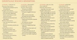
Based on their observations (see below), Corgan’s team offers the following takeaways:
• Consider wayfinding strategies with multiple elements and large signs. Participants tended to look down and reacted more slowly, which led them to miss signage. Wayfinding strategies that incorporate both floor and wall elements could help improve communication.
• Investigate signage locations with areas of bright light and intense shadow. Consider films or frits to help reduce the amount of glare and strong shadows. Minimize the use of white finishes in brightly lit spaces, which can cause glare.
• Include “fatigue mitigation” stations. Break up long distances with areas where occupants can rest and confirm the correct direction.
• Avoid changes in level along primary pathways. Make sure elevator/escalator cores are readily visible and accessible.
Design with multiple senses in mind. Some users use sight, others depend on touch, sound, or smell.
• Provide seating of different levels (e.g., standard seats, high seats, and something to lean on).
• White text on green was by far the most preferred signage method. White text on blue was also very effective. Backlit signage is highly recommended.
• Avoid using low, protruding objects, such as low chairs and tables.

