Education is changing, and school design is changing with it. The old-fashioned classroom, filled with rows of front-facing desks, is giving way to other types of learning spaces. The walls of the classroom itself are being transformed. Flex spaces, collaborative areas, learning studios, lab-like spaces, and open classrooms are changing the architectural vocabulary of school design. In this evolving environment, color will come to play a more important role in design.
Color is being used not only as a backdrop for learning, but also for significant functional purposes such as wayfinding and delineating spaces. Contemporary research is upending a number of the most common assumptions about “appropriate” colors for learning environments, too. Smart use of color in a learning environment works with the natural tendencies of the human brain. We are wired to seek out patterns as a primary problem-solving mode in everyday life. Color easily becomes an associative key for defining a space, or grouping several different spaces into a single category.
As a result, architects are bringing more color, bolder color, and more nuanced color into education design. Brightly contrasting colors make spaces lively. Large color graphics and signage tie together different spaces to create visual unities, and strong visual cues create a sense of location and order. And a new sense of colorfulness makes educational experiences a little brighter.
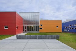
Designed by DLR Group, Panther Lake Elementary School in Federal Way, Wash., serves an area dominated by low-income transient families from diverse backgrounds and languages. Each of the different buildings is painted a different bright color, helping young students and families to find the right place easily, regardless of language barriers. The design of the campus visually connects interiors to the surrounding outdoors to increase a sense of orientation.
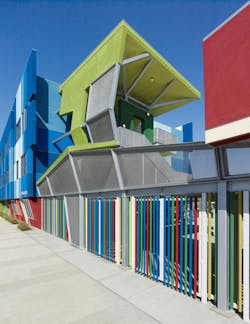
Moreover, color has known effects on mood and the thought process. Certain colors have been shown to produce calming effects, improve focus, or lower anxiety, while others can stimulate aggression, or be distracting. Children also respond to colors differently at different ages. For example, at another DLR Group project, Wisdom Elementary School in Los Angeles, the building’s exteriors are painted in bright multicolor geometric designs. The aim is to make school look like an exciting place to go and learn.
Los Angeles Unified School District South Regional ES #6
The psychological impact of color means that color has to be selected specifically for the types of activities that a space will host, and for the age of the students. It also has to be selected for the pedagogical style of the particular school. An educational approach that makes heavy use of collaborative learning may have very different needs than a school with traditional eyes-front classrooms. A color that promotes calmness and focus may be the best choice for a college lecture hall but not for a middle school learning lab.
A great deal has been written about this subject, and much of it is available online. These papers and studies, however, should be read with a critical eye. They are not always clear about the educational assumptions that underlie the recommendations, and do not always differentiate between studies of the effects of color on humans in general, studies that look specifically at children, and studies specifically looking at learning environments. Color is a powerful tool, and should be applied with thoughtfulness and care when considering the students coming and going through our K-12 schools.

