Repositioning of historic Sears Roebuck warehouse enlivens Boston’s Fenway neighborhood
Developer Samuels & Associates asked Elkus Manfredi Architects to reimagine the former Sears Roebuck & Co. warehouse in Boston’s Fenway neighborhood as a dynamic mixed-use destination that complements the high-energy Fenway neighborhood while honoring the building’s historical significance.
The result is a Silver honoree in Building Design+Construction’s 37th Annual Reconstruction Awards.
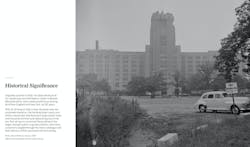
Sears Roebuck campus, ca. 1954. Photo: Courtesy Boston Public Library
A RETAIL POWERHOUSE IN NEW ENGLAND AND BEYOND
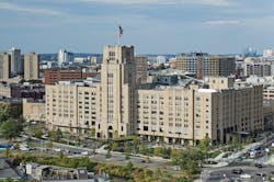
Opened in 1928, the Sears warehouse and distribution center—an eight-story limestone and brick commercial building with a 12-story tower centered above the southwest elevation—was a retail powerhouse serving all of New England and parts of New York for 60 years. After drawing shoppers and employees to the Fenway neighborhood for decades, Sears abandoned the nearly one million-sf building in 1988.
Soon after, it was protected from demolition when it became an official Boston Landmark and was listed in the National Register of Historic Places. The building was reopened in 2000 as the Landmark Center with a movie theater, office spaces, big-box retailers, and parking lots.
Sears catalog wall covering. Elkus Manfredi Architects led the project team for developer Samuels & Associates. Photo: © Connie Zhou
By the late 2010s, the Fenway area had evolved, leaving the Landmark Center behind. The neighborhood enjoyed a renaissance over two decades due to numerous Samuels & Associates projects that helped turn the formerly blighted area into a dynamic, pedestrian-oriented live-work-play community.
Now with its retail and dining mix unresponsive to the changing neighborhood, office spaces underused, and architecture obscured by inappropriate 20th-century renovations, the historic building would, in the developer’s view, benefit from repositioning.
The stately landmark had potential to be a neighborhood magnet once again, a gateway to Boston’s booming Fenway neighborhood facing the Longwood Medical area and the newly restored Muddy River link of Frederick Law Olmsted’s Emerald Necklace park system with connective public realm to support collaboration and recreation among workers, residents, and visitors.
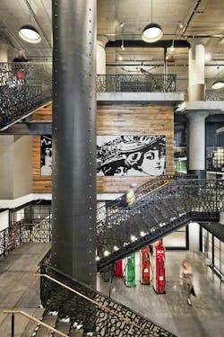
Monumental stairwell with preserved historic structural features. Photo: © Connie Zhou
DESIGN GOAL: A WORK/PLAY HUB LINKING TWO NEIGHBORHOODS
The developer engaged Elkus Manfredi Architects to reimagine the historic building as a work/play hub that would become a thriving center for innovation and community, linking two of Boston’s dynamic neighborhoods.
After a design process that included extensive coordination with the community, the Landmarks Commission, and the Parks Department, 401 Park—as the building is now called—is once again a vibrant community hub that remains true to its roots.
The successful execution of a grand vision for a center of 21st-century innovation and acute attention to detail resulted in a space that inspires collaborative creative thought, welcomes visitors, and fosters community in a fiercely proud Boston neighborhood.
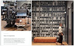
Linotype machine used to print the Sears catalog (left) © Connie Zhou. Movable type wall motif (right) © Robert Benson
VISION LEADS TO A NEW PARK, FOOD HALL, BREWERY, AND RETAIL SHOPPING
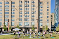
A welcoming one-acre park created in place of a big-box retail parking lot provides an all-season public gathering place not only for office tenants, diners, and shoppers, but also for the entire Fenway neighborhood. It embraces the Emerald Necklace at a point where a significant landscape renovation restores vegetation and access to the Muddy River and a popular bike/pedestrian path completes its meandering path through several neighborhoods. During the winter months, the lawn becomes a skating rink.
A new one-acre park and sustantial landscaping features were added to unite two local neighborhoods. Photo: © Connie Zhou
A glass-walled kiosk housing the Trillium Taproom and Brewery is located next to the lawn/rink to complete this year-round event space.
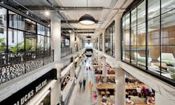
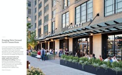
A new 25,000-sf dining/food hall developed by Time Out Market features multiple stalls from well-known as well as up-and-coming chefs. Communal dining tables are located both inside and outside, with new, fully operable storefront windows that fold up and away to blur the lines between inside and outside. Open to the floor above with new glazing on the second and third floors, the design allows light to filter in from the atrium above.
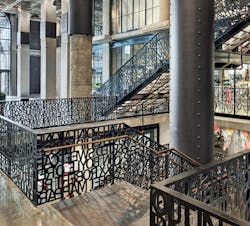
The food hall leads into an enormous two-story ground-floor atrium lobby, with comfortable living-room seating areas that invite conversation. Massive original columns and pieces of the second-level floor plate recall the original building and create a dramatic sense of scale. A new custom-designed, three-level industrial iron staircase featuring Boston-centric names and places leads up to the second level or down to valet parking beneath the building.
New restaurants and upscale retail shopping elevate the visitor, shopper, and occupier experience at 401 Park. Photo: © Connie Zhou
The big-box retailers at ground-level have been replaced with more sophisticated, urban-focused shopping opportunities that respond to the vibrant, walkable Fenway neighborhood.
Two atria were created out of underutilized space and have become amenity extensions of the office spaces that occupy the upper floors above.
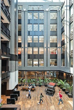
On the second level, a large open breakout area offers more seating and connects to two atria spaces that serve as lobbies for the offices on upper levels. The two atria are topped by glass ceilings that allow daylight to stream into the soaring spaces. Here, office workers can work in an inspiring environment, hold impromptu meetings, or enjoy coffee with colleagues. Atrium furniture and millwork have power and data connectors to allow people to work outside their offices.
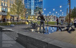
A thoughtfully curated public art program includes artifacts that celebrate the building’s history as a Sears warehouse and distribution center while also introducing new works--a playful new installation of outdoor sculpture—Grouping of Works from Fountain, 2017-2019—created by Brooklyn artist Nicole Eisenman.
Sculptures by Nicole Eisenman enhance the landscape, designed by Leblanc Jones Landscape Architects. Photo: © Charles Mayer Photography
GRAND ENTRANCE OPENS A CONNECT TO BROOKLINE AVENUE
With a vision to create a grand entrance under the tower and open a connection to Brookline Avenue, the design team called for removal of large sections of the second-level floor plate as well as walls on the second and third levels to introduce glazing.
Connecting the office lobby atria to this grand space and introducing more light to the ground-level entrance lobby and new food hall was another priority. Architects and engineers collaborated to determine the optimal way to achieve this design. Steel collars around the columns reinforce the supports with added structural support beams in the ground-level lobby and the food hall.
The reimagined lobby—the new heart of the historic building—connects the public spaces open to office tenants and visitors like never before, with comfortable seating and work areas to activate the grand spaces and support collaboration and productivity in today’s mobile work/play world.
Exterior view of the completed project showing neighborhood context. Photo: © Robert Benson
PARKING LOT CONVERTED INTO AN ALL-SEASON PUBLIC PARK
Activating the public realm also meant reimagining outdoor spaces, notably converting a parking lot into an all-season public park that embraces Olmsted’s Emerald Necklace. A glass pavilion set to the side of the one-acre park hosts a top-tier local brewery and tap room.
Efforts to enhance the building’s porosity at the pedestrian level encourages greater interaction and opportunities for connection between the building and the neighborhood. Garage door windows that fold open in nice weather blur the lines between inside and out at the food hall. Spacious paths connect the highly walkable neighborhood with public transportation.
The designers kept asking: What kind of building is this? What are its true design roots? Its original Art Deco elements had been minimal; however, interim renovations had emphasized this aspect of the building.
East atrium at 401 Park. The Cranston press in the photo was used to print the Sears catalog. Suffolk was the general contractor for 401 Park; WSP Flack & Kurtz, the MEP engineer; McNamara Salvia, the structural engineer. Photo: © Connie Zhou
Opting to celebrate the building’s industrial design roots as more genuine, Elkus Manfredi’s designers took the building back to its bones, removing the Miami-style Art Deco motifs that have been added over the years to reveal the true character of the building.
Design features now include exposed concrete pillars and dark metal frames on windows and storefronts. Pneumatic tubes that were used to move merchandise throughout the complex inspired industrial design of architectural elements such as light fixtures, staircases, and security desks.
ART PROGRAMMING REFLECTS THE SEARS, ROEBUCK LEGACY
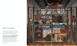
The building’s history also informed the art programming for the new space. The consultant collected samples of Sears Roebuck catalogues from every decade of the building’s operating period, and canvassed the country to collect vintage objets d’art of items once sold via the catalog.
The historic artifacts—from Instamatic cameras to butter churns, bicycles to musical instruments—are displayed on industrial shelving in a way that they might have appeared on warehouse shelves.
Artifacts of Sears products were curated. Photo: © Robert Benson
JUDGES’ PRAISE FOR MAINTAINING ‘AN INDUSTRIAL FEEL TO THE BUILDING’
The Building Design+Construction Reconstruction Jury endowed the project with Silver Honors.
"An amazing building, huge scale, and some very interesting design features,” Eric J. Rosenberg, PE, LEED AP, Project Manager, Grumman/Butkus Associates.
“The project team maintained an industrial feel to the building with the mix of metals and exposed concrete, and the pneumatic tubes that moved merchandise in the building inspired light fixtures,” said Stephanie Adamczyk, Project Executive, Ryan Companies. “The staircase railings are a well-executed detail, along with the lobby ceiling heights exposing column pad details. I also enjoyed the addition of green space.”
Custom staircase railing, with numerous references to local history. © Robert Benson
401 PARK | BOSTON, MASS.
BUILDING TEAM: Submitting firm and architect Elkus Manfredi Architects Owner/developer Samuels & Associates Structural engineer McNamara Salvia MEP engineer WSP Flack & Kurtz Landscape design Leblanc Jones Landscape Architects General contractor Suffolk
PROJECT INFORMATION: Size 952,000 sf Cost Withheld at owner’s request Construction period (Phase 1) September 2018 to September 2019 Delivery method Design with CM at risk
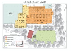
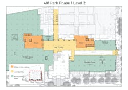
401 Park Phase 1 Levels 1 and 2. Courtesy Elkus Manfredi Architects
