Economists are predicting modest but continued growth for the U.S. office construction market. FMI’s 2014 U.S. Markets Construction Overview anticipates that construction put in place in the sector will be fairly flat this year but could beat 2013 by up to 4%. Jones Lang LaSalle foresees a 6% increase in office project completions this year.
The New York-based project management consultancy Faithful+Gould points to decreasing vacancy rates as an indicator of growth, but says owners are likely to focus on upgrading existing buildings.
Whether created through renovation, adaptive reuse, or new construction, today’s workplaces are a notable departure from those of the past. Formerly, perimeter executive offices surrounded bland, productivity-draining expanses of repetitive workstations. Poor acoustics, limited flexibility and views, and a lack of meeting space marked these walled-in, open-plan “cubiclevilles.”
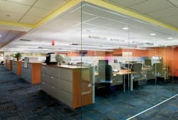
Now, the walls are coming down. Driven by changing work styles, mobile technology, and the growing presence of Millennials—people born between the early 1980s and 2000—today’s workplaces are changing, mostly for the better. Perimeter offices are disappearing, floor plans are opening up, and trendy breakout areas and cafés are replacing the rigid, closed layouts of the past, says Barry Fries, founder and CEO of contractor B.R. Fries & Associates (www.brfries.com). “More than ever, we see young companies owned or dominated by Millennials gravitating toward historic downtown buildings, where they’re installing sustainable, laid-back interiors with adaptable furniture systems and a surprisingly high finish quality,” he says.
You will earn 1.0 AIA LU/HSW by reading this article and passing the exam. Take this free course at BDCUniversity.com.
With 72% of corporate real estate executives saddled with the responsibility of productivity improvements, according to Jones Lang LaSalle, decision makers are putting the emphasis on modifying their facilities to support creativity, focus, and teamwork.
HERE COME THE MILLENNIALS
Baby Boomers made up more than half of the U.S. workforce in 2010, according to JLL; by 2020, they will be outnumbered by Millennials. A study by Forbes projects that three out of four workers will be Millennials by 2025. This ambitious, tech-savvy, creative cohort has notably different working styles and preferences than other generations; for instance, Millennials may be more productive sitting in cafés or lounge areas than in traditional workstations. Their ease with mobile technology enables many of them to work anytime, anywhere.
In some high-tech companies run by Millennials, nonconventional workspaces are the thing. “Millennials are collaborators, and they don’t like to isolate themselves,” says Marlyn Zucosky, IIDA, Partner and Director of Interior Design with JZA+D (www.joshuazinder.com). “Providing more open places for informal meetings is a successful strategy. And Millennials in general have a lower demand for privacy than Baby Boomers.”
High-tech companies have amplified this trend, according to workplace experts. “Google and Facebook have cutting-edge offices created by the young entrepreneurs who founded these companies, and they had no rules or standards to abide by, so they established their own,” says Barry Poskanzer, AIA, Partner, Poskanzer Skott Architects (http://poskanzerskott.com). “Many workplaces are becoming the physical manifestation of the ‘business casual’ trend.”
Hierarchy, tenure, and seniority are no longer the key factors in design, and flexible work zones are displacing high, opaque walls, says Karen Thomas, CID, LEED AP BD+C, a Principal of architecture firm LPA Inc. (www.lpainc.com). The firm’s user surveys show that employees are more productive when given a variety of places in which to work. “Employee costs are the largest expense for any company, so making staff comfortable benefits the bottom line,” says Rick D’Amato, AIA, LEED AP BD+C, another LPA Principal.
Forging understanding between the generations is important in this era of transition. “While Boomers are often still the ones making long-term decisions about real estate and workplace strategies, they may retire before the end of a 10-year lease,” notes Steve Hargis, Executive Vice President in Strategic Consulting in Jones Lang LaSalle’s San Francisco office. “Therefore, it’s important to raise their consciousness level around the lasting effects of their workplace decisions, as the subsequent generations will be the ones to live with those decisions.”
DENSITY, EFFICIENCY, AND UTILIZATION
With workers spending more time away from their workstations, workplace density is on the rise. According to the global technology research firm Gartner Group, knowledge workers typically spend just 40% of their time at their desks, and non-group tasks have decreased to about 20% of the working day. As a result, personal workspaces can shrink—and they are, decreasing 30–40% in floor area as Building Teams help companies reinvent excess space, according to Lenny Beaudoin, Senior Managing Director of Workplace Strategy, CBRE, New York City (www.cbre.com).
“Personal workspaces are getting smaller, because the technology we’re using is smaller,” says JZA+D’s Zucosky. “Flat-screen monitors allow shallower work surfaces, which means less footprint per workstation.” She adds that providing space for document piling is far less important today, with most documents residing on computers. Rachel Casanova, LEED AP ID+C, an Associate Principal and Director of Workplace Strategy with Perkins+Will New York (www.perkinswill.com), says individual desk size is decreasing in width, to around five linear feet. “This is probably the smallest we can get, but now we need to focus on how we can make office spaces more effective,” she says.
In 2001, an average of 300 sf was allotted per worker. By 2010, space allocation was down to 225 sf––and in 2012, it dropped to 176 sf per person, according to CoreNet Global. The corporate real estate association has predicted that the metric could go as low as 100 sf per person within a few years. In part, the trend is the result of moving casual meetings from the cubicle or office to a huddle area. “There was a time when managers had guest chairs in their workstations,” says Zucosky, but they are being replaced by “more interesting furniture,” such as upholstered-top mobile file cabinets and layered work surfaces that offer a place for the visitor to perch for that brief conversation.
It must be kept in mind, however, that efficient design is “not about decreasing square footage, but about increasing utilization,” says Dennis Gaffney, AIA, IIDA, LEED AP, a Vice President at RTKL (www.rtkl.com).
Lisa Killaby, IIDA, LEED AP, a Principal with ADD Inc. (www.addinc.com), says her firm uses evidence-based assessment and analysis to help clients discover ways to improve workspace efficiency and effectiveness. Utilization studies are one such tool, says P+W’s Casanova. In the past, workplace designers would plan 100 desks for every 90 people in the office, or 90% utilization. Now, some companies are shooting for something more like 120-130% utilization, because employees are spending more time in meeting rooms and project spaces, at clients’ offices, and telecommuting.
TO ASSIGN OR NOT TO ASSIGN: STILL THE BIG WORKSTATION QUESTION
To accommodate more people with fewer desks, designers are turning to strategies such as desk sharing, free desking, benching, and hoteling. Unassigned touch-down spaces, which may be open or enclosed, offer a modicum of visual and acoustical privacy and the ability to support individual work or one-on-one meetings. “Furniture can be either casual lounge seating with an integrated work surface, or a table with two chairs,” says LPA’s Thomas. “Ideally, these spaces can be equipped with writable wall surfaces and access to daylight.” A wall-mounted flat-screen monitor is an optional but nice-to-have element.
Where assigned individual workstations are provided, they are generally becoming smaller and simpler. “The allocation of individual workspace is becoming less about hierarchy and entitlement, and more about function and fit,” says Bernice Boucher, JLL’s Managing Director and Workplace Strategy Practice Lead.
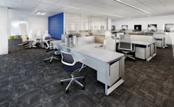
While their primary purpose is to serve heads-down focus work, workstations should also be designed to support one-on-one collaboration and the ability to turn an individual’s work surface into a table where a visiting colleague can fit, say, a notebook and cup of coffee. Work surfaces are being coupled with semi-fixed power/data splines that support movable components. “These enable employees to modify configurations when greater collaboration is in order,” says Fries. This level of flexibility can even reduce the need for dedicated collaboration spaces within workstation clusters, says Thomas, since workers can more easily achieve connections by moving elements on their own.
Workstation wall panels are also shrinking in height to avoid the much-maligned “cube farm” model. Lower walls are better for employee connections, says Fries.
Recent workplace concepts have attempted to create neighborhoods, which are not necessarily departmental or project-based groupings. Instead, the goal is to help employees identify with their neighborhood: to change their focus from “my space” to “our space,” to give workers a feeling of membership in the club, as opposed to simply ownership of a desk, says Boucher. Consider using distinctive furnishings, lighting, and colors to brand each neighborhood with its own visual identity.
Whatever the scheme, these concepts imply new work modalities as well as novel design solutions and better technology support—all integrated with human resources strategy, says Casanova.
Behind salaries and technology, the cost of real estate is the biggest line item for most corporations, so driving down facility size through efficient space utilization reduces overhead. “Increased density is not only a financially driven best practice,” adds Boucher. “It also drives engagement and social interaction in the office.”
OPEN, BUT NOT TOO OPEN
While workplaces are trending toward open and flexible environments, designers must remember the need for quiet, private spaces. According to a database created by design firm Gensler, encompassing information from more than 90,000 respondents gathered during the past five years, focus work is seen as the most crucial activity—one that also requires the majority of worker time.
Design strategies that prioritize collaborative space at the expense of individuals’ ability to focus have a higher likelihood of backfiring. “This continues to be the great debate, and the pendulum is swinging again,” says Juhee Cho, Workplace Studio Leader with SmithGroupJJR (www.smithgroupjjr.com). “Many people argue that they need acoustical privacy in order to be productive, while others succeed being surrounded by their colleagues, stimulated by their energy.”
Ultimately, the Building Team must assess each organization’s unique needs, based on such factors as the client’s industry, market, corporate culture, demographics, recruitment, and retention. “The team should begin by analyzing the work,” says Poskanzer. “What kinds of tasks do the people address? What kinds of relationships do they have, what do they need, and how do they work with other employees?”
Achieving an optimal mix of zones involves minimizing interruptions and distractions in private spaces, says Rob Sannella, Regional Leader of Consulting in HOK’s Toronto office (www.hok.com). Quiet work areas should not be positioned next to communal areas, and designers should seek out effective acoustical treatments and architectural barriers.
The principles can sometimes be counterintuitive. “We’ve seen that some higher workstation panels actually increase ambient noise within an open environment, as the occupants feel they have more privacy than they actually do and tend to speak more loudly,” says LPA’s Thomas. “There is a delicate balance between creating critical visual connections and communication, and much needed acoustical privacy within the work environment.”
Among the attempted solutions: small phone booth designs developed for companies like Pandora, says Andrew Bartle, AIA, LEED AP, Principal of ABA Studio (www.abastudio.com). His firm designed these private, acoustically isolated focus areas set behind CNC-milled wood slats. “In the high-tech industries, we see dense occupancies through open-office environments, but leading companies are sensitive to the need for each individual’s personal privacy,” he says. “This can be accomplished through small private rooms for one- or two-person calls, discussions, and focus work—and other spaces with different degrees of privacy.”
Employee behavior also affects focus, says JLL’s Boucher. For example, workers should be educated to understand that checking voicemail on a speakerphone in an open-plan environment can distract coworkers. By modifying working styles and using alternate spaces when extended conversations are required, employees can help mitigate background noise and support their colleagues’ focus.
Poskanzer Scott’s recent design for Mediacom’s new headquarters in Blooming Grove, N.Y., places employees in open areas with individual cubicles or clustered, six-person pods, depending on the nature of their work. The open layout incorporates seated privacy. Partitions are high enough that when employees are seated they are looking at walls; when they stand, they can see the whole office. The Mediacom layout incorporates flexible rooms that can be used as shared offices, as conference areas, or for tasks requiring privacy. The balance between open and closed varies by department.
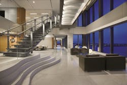
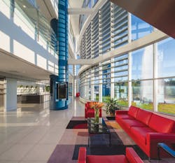
The open office layout is still valued, in part, for its original benefits. In late 19th- and early 20th-century commercial buildings without modern lighting and air-conditioning, central bullpens helped channel fresh air and daylight deep into the floorplate. These ideas resonate today, but now some clients prefer to place walled, enclosed offices or conference rooms toward the building core and open-plan workstations toward the perimeter, with plenty of window area. Building Teams are extending this approach, which many see as more egalitarian, by ensuring that communal areas also have access to daylight and views.
It’s all about “getting the greatest number of people possible as close to the window lines as possible,” says David Varner, AIA, LEED AP BD+C, Vice President, SmithGroupJJR.
Studies establishing the positive relationship between natural light and worker productivity and satisfaction are well known. CBRE’s Beaudoin also emphasizes daylight’s proven positive effects on alertness, regulating the body’s circadian rhythm, and minimizing eyestrain and headaches. Increased daylighting should also reduce lighting power densities, but thoughtfully located overhead lighting, and strategic combinations of fixtures, layout, furnishings, and daylight levels, can yield even greater savings, says Varner.
MODULAR SYSTEMS: RESPONSIVE, SUSTAINABLE, AND AFFORDABLE
Modularity and flexibility are becoming increasingly important workplace considerations in today’s business world. “Office users reshuffle the deck frequently to reflect new processes, product development approaches, and corporate structures,” says Andrew Franz, RA, founder of Andrew Franz Architect (www.andrewfranz.com). “Many of today’s younger, green-thinking entrepreneurs are asking for portable furniture and reconfigurable systems so they don’t have to throw away expensive interior systems if they move locations.”
Many vendors offer modular systems composed of interchangeable parts, including raised flooring, furnishings, and walls. Wireless technology and plug-and-play equipment also support reconfiguration. Often, modular components can be demounted and moved, even to another building entirely.
Modularity applies to the planning process as well, says HOK’s Sannella. By making private offices and conference rooms the same size, it is much easier to repurpose space by moving furniture, as opposed to knocking down walls. Small offices can be planned as 10x10-foot modules; two modules can be combined to create a 10x20-foot office. Another option is to use a demountable partition or folding wall to temporarily break up one large office into two small ones.
“The ability for all spaces to serve multiple uses allows for a great utilization of space and a reduction of the overall space requirement,” says ADD’s Killaby.
Flexibility helps offset the difficulty of anticipating clients’ future workplace needs, even for the short term. “Any designer can tell you that the initial program for a design never matches the occupancy at move-in, and the occupancy at move-in never matches the post-occupancy evaluation,” says RTKL’s Gaffney.
WORKPLACES, NOT JUST WORKSTATIONS
Most modern workplaces incorporate one or more communal areas, as well as meeting rooms, unenclosed breakout areas, and casual seating groups. To make these zones effective, well-planned layouts and furnishings are essential.
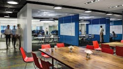
The office commons: The new social hub. Ideally incorporating daylighting, outdoor views and, if possible, outdoor access, these areas should have a different vibe than work zones. The spaces may include tables, chairs, comfortable lounge furniture, bar-height tables and stools, coffee service, WiFi, semi-private booths equipped with power for charging devices, writable surfaces, and mobile dividers. The easier it is for employees to move items around, the better.
“As the nucleus and social hub, these areas have become the norm in workplace design and play a critical role in increasing cross-fertilization between groups,” says JLL’s Boucher. “The space should be a magnet for people and activities and provide a variety of settings to support collaboration, not just lunchroom-style tables and chairs.”
“In some cases, the shared functions of copy room, dining area, pantry, and laydown space can be clustered to create a commons or the so-called ‘downtown’ of an office floor,” says JZA+D’s Zucosky. If possible, have one commons where clients and visitors may go and a back-of-house commons strictly for employees.
One advantage afforded by common zones is that coworkers can gather for group meetings and not worry about reserving a conference room. Building Teams should make sure the inevitable noise doesn’t interfere with areas set aside for performing quiet focus work. “Boundaries and zoning are important, and the pathways into and out of these spaces should be carefully designed to minimize conversations that may continue from the café on the way back to one’s desk,” says Janice Barnes, AIA, LEED BD+C, Global Discipline Leader in Planning and Strategies for Perkins+Will New York.
Conference/project rooms: Emphasis on functionality. Defined as dedicated collaboration spaces located near work groups, conference/project rooms with great functionality trump those with fancy finishes and furnishings, according to CBRE’s research. Furniture should be movable but not necessarily mobile, enabling easy reconfiguration while discouraging relocation via “borrowing.” These spaces should include lots of writing surfaces, and they should be as ergonomically comfortable as working at one’s own desk, says Barry Fries.
“Technology is key in these spaces,” says LPA’s Thomas. Users should be able to access information and content wirelessly, to project from personal devices onto wall-mounted flat screens, and to engage with other team members remotely via videoconferencing or FaceTime.
In general, avoid the temptation to oversize these rooms. JLL’s research has found that 75% of meeting rooms are designed for four people or less. Huddle rooms, equipped with technology and display tools, often provide a greater return on investment than larger conference rooms, says Boucher.
Some large rooms may still be required to host bigger group or client meetings, training sessions, or lunch-and-learns. “We find it helpful to have the ability to join rooms or open spaces for larger groups or different events,” says SmithGroupJJR’s Varner. There may also be a need for project rooms or war rooms where teams can camp out for a longer term. Here, collaborative tools are essential, as is storage space for personal belongings and project collateral.
Give special attention to spaces used for client meetings. It’s best to put them somewhere that doesn’t force clients to traverse the office to reach the meeting room, says Fries. The spaces should appropriately showcase the company and its brands, and should incorporate welcoming features, conveniences, and accessibility for the handicapped and elderly, adds Varner.
Breakout spaces: Spontaneous combustion. Even with flexible arrangements of workstations and offices, breakout spaces are often still desirable. Ideally located where primary circulation aisles converge or just outside conference rooms, they demand some acoustical isolation to prevent noise from bothering nearby employees engaged in focus work. “These spaces encourage interaction and spontaneous conversation, and should be designed with mobile and casual furniture, work tools, and technology,” says Thomas. “Often, breakout areas are furnished with formal lounge seating, and coffee tables that are rarely used. That becomes not only a waste of space but in fact a deterrent to collaboration and communication.”
Varner also sees transparency as an important design feature for breakout spaces. Equipping these zones with comfortable seating can provide relief from hours in desk chairs. Increasingly, experts see alternative seating, such as round-topped cushioned stools and even standing desks, as desirable for individual workstations and offices as well, to alleviate back, neck, and leg fatigue.
LIFESTYLES AND RECRUITING
Companies are embracing employees’ needs for work-life balance in an attempt to boost satisfaction, productivity, and retention. Yoga classes, walking clubs, bike racks, wellness rooms, and daycare facilities represent just a few of the strategies. Some companies incorporate light recreational amenities such as ping-pong and pool tables as stress relievers. Others are asking volunteer health councils made up of employees to develop fun ways to promote wellness.
“If sitting is the new smoking, then we should be thinking about what can be done to support more movement at the office,” says Boucher. This might be as simple as encouraging stretching breaks, or active designs that push people to use stairs, says Perkins+Will’s Barnes.
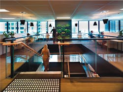
In the past, kitchens were located as close to workstations as possible to minimize time spent getting up to refill the water bottle. However, research has shown that walking around during the day is important to employees’ physical and emotional health. CBRE’s Los Angeles office was designed with a flight of stairs directing foot traffic through the main collaborative area. “We do this to challenge convenience just enough to get our employees moving, collaborating, and taking the stairs, rather than the elevator,” says Beaudoin.
Consumerism is increasingly related to job satisfaction on a grander scale. “Many of our clients are realizing that an inspiring workplace is just as important as offering a big salary and good benefits,” says HOK’s Sannella. “Many people are drawn to jobs with facilities that are not only inspiring, but fun and comfortable with lots of amenities.”
Community gathering spaces, appealing food offerings, workout facilities, outdoor break areas, recreational amenities, modern furnishings, and advanced technology platforms communicate the message that an employer cares for the well-being of employees, which can be a big aid to recruitment and retention.
Boucher points to a recent Oxford Economics study projecting that talent supply will be inadequate to meet demand in North America from now until 2021. Organizations with appealing workplaces will have an edge.
What matters most is making employees feel valued, says Poskanzer. “Recognizing that the quality of their lives matters—and letting prospective employees know that—will always give a company a leg up on the competition.”
THE BRANDED WORKPLACE
Organizations are also trying to reinforce a sense of community and loyalty through branding within the workplace—a concept that’s sometimes literally woven into the fabric of the office furnishings, says JZA+D’s Zucosky. Today’s branding schemes are all about creating a memorable, inspiring, and immersive experience.
“‘Branding’ has become a way of telling the company’s story—what the company is about and what their core principles are—and conveying this through the environment,” says P+W’s Barnes. Color palettes, furniture, environmental graphics, and built narratives all contribute, says LPA’s D’Amato.
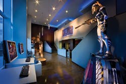
When working on a corporate headquarters for the Watson Land Co. of Carson, Calif., LPA discovered that the firm’s history included a 75,000-acre land grant by King Carlos III of Spain, in the late 1700s. Celebrating this important piece of history, the design team had a historic map etched on a 20-foot glass wall running along an open staircase. For Blizzard Entertainment’s headquarters in Irvine, Calif., LPA used an immersive mix of imagery, materials, and colors to imbue each floor with a video game theme.
“A significant and recognizably branded interior can reinforce corporate values and processes while also inspiring the staff,” says D’Amato. “Branding is most effective when it is used to illustrate a narrative while creating a branded ‘lifestyle.’”
Building Teams can help organizations find clarity through the process of developing a brand and determining how to express it within the built environment. Only when there is clarity can the brand be embodied in the client’s architecture and interiors.
