Curating Your Vision: How We Bring Color of the Year to Sherwin-Williams Coil Coatings
Excitement builds with every coat of paint. An update to an office complex sparks forward momentum. A bright refresh on a hospital arouses hope for those walking through its doors. A revitalized residential space sets the scene for families to form new memories together.
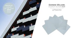
This is the power of color — it inspires, motivates and uplifts. Each year, Sherwin-Williams brings together a panel of color-minded experts who combine research, analytics and trend tracking to conceptualize not only what we want, but also what we need. From this methodical analysis, Color of the Year is born, providing a chromatic touchstone to unite people across generations, industries and locations. Upward, our 2024 Color of the Year, is a breezy and tranquil shade of blue. It brings a clean slate and a sense of possibility to any setting, allowing your creativity to soar.
The Sherwin-Williams color ecosystem stretches far beyond house paints, and a dedicated team of color experts ensures the annual selection is appropriately translated to industrial markets, too. Located in Minneapolis, Minnesota, the DesignHouse is a first-of-its-kind facility that brings collaboration, thought leadership and color inspiration to the industrial market through the skills of key color experts such as Global Color, Materials, Finish & Trend Manager Kiki Redhead and Architectural Color Designer Brynn Wildenauer.
“Color of the Year is researched across our organization,” said Redhead, who is part of the Sherwin-Williams team that takes a thoughtful approach to color forecasting. “This team, which represents each of our business units, gathers throughout the year to share updates on their research of trends and color.”
As a color leader at the DesignHouse, Redhead determines how the color space is evolving and considers which enhancements, effects and finishes could be used in the various markets for long-term use. This is not the place for the same microtrends that affect home decor like throw pillows and change with the seasons.
To adopt a color or palette to the industrial market, color experts like Wildenauer establish that it is sustainable in the market — and on the side of a building — for years to come. Longevity is a key when they consider how Color of the Year will be used in factory applied coatings.
Various industries, segments and products are independently considered when determining where a Color of the Year will be applicable, because they each approach the color differently. With the help of a color expert like Wildenauer, customers can better understand their options. Applying Upward with a wood grain might be more residential, for example, while combining it with a mid-tone gray in a concrete print could make a statement on a commercial building.
Utilizing the available range of finishes and effects, the color team pushes expectations and helps customers break out of a rut of muted palettes. For Upward, options include base, low gloss, high gloss, texture, Fluropon® Classic II, Kameleon, Nova, WeatherXL™ and WeatherXL Crinkle.
“We’re taking those effects and bringing it to an application that people don’t typically expect,” said Wildenauer. “It’s an inspiration thing — we push peoples’ expectations and inspire them to consider other options.”
In the agricultural market, it might be the siding of a barn or a garage door, whereas in commercial buildings, a color like Upward could be used as a small accent in siding or on a larger scale on panels. Upward is already making a splash on commercial high rises and residential units, and the opportunities are endless. By examining color schemes, including the previous Color of the Year hues, the Coil Coatings team explores how this year’s selection can work with the existing products around it, from gutters to siding to appliance and more.
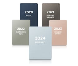
While curating the Color of the Year in recent years, the forecast team selected a variety of tones with careful consideration of how they work together. Though Naval and Urbane Bronze are both dark tones, they are very different chromatically. In 2021, the mid-tone Evergreen Fog lightened up the palette, which the light terracotta of Redend Point took even further. Upward continues the shift, while still working cohesively with the palette, ensuring the staying power of these color applications.
The team at the DesignHouse is skilled at hearing a vision and conceptualizing how customers can successfully incorporate Upward into their project. The airy hue works as an accent but could also serve as a base neutral. When paired with Urbane Bronze, they behave as two neutral tones working together, but with a tone like Evergreen Fog, it takes an expert to find the perfect balance between base and accent.
Understanding the longevity of color trends — in addition to the range of effects, technologies and resin systems available — is important while developing a custom coating. Through collaboration with a team of color-minded experts, customers can curate their vision. To start a consultation and bring your next project to life, contact the DesignHouse today!
