Best in Architecture: 18 projects named AIA Institute Honor Award winners
By AIA
The American Institute of Architects has selected 18 recipients of the 2016 Institute Honor Awards, the profession’s highest recognition for works that exemplify excellence in architecture, interior architecture and urban design. The 18 recipients, located throughout the world, were selected from around 500 submissions and will be honored at the AIA 2016 National Convention in Philadelphia. The winners were broken into the three categories of Architecture, Interior Architecture, and Regional and Urban Design.
The following is a recap of the winning projects (descriptions and images courtesy AIA). For more images or longer descriptions of the recipients, see the AIA’s report on the winning projects.
2016 Institute Honor awards for Architecture
The 2016 AIA Institute Honor Award for Architecture jury includes: Josiah Stevenson, FAIA (Chair), Leers Weinzapfel Associates Architects; José Alvarez, AIA, Eskew+Dumez+Ripple; Brad Cloepfil, AIA, Allied Works Architecture, Inc.; Roberto de Leon, AIA, De Leon & Primer Architecture Workshop; Julie Eizenberg, FAIA, Koning Eizenberg Architecture, Inc.; Julie Engh, Assoc. AIA, Highland Associates; Elizabeth Hallas, AIA, Anderson Hallas Architects, P.C.; Danielle Jones, AIAS Representative and Christian Zimmerman, FASLA, Prospect Park Alliance.
American Enterprise Group - National Headquarters Renovation; Des Moines, Iowa
BNIM
© Nick Merrick Hedrich Blessing
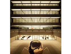
This project encompasses the nearly invisible rehabilitation of an eight-story office building designed by SOM’s Gordon Bunshaft, which received a 1967 AIA Honor Award for Architecture. Original systems were meticulously integrated with the building architecture. Rehabilitation required substantial demolition of the interior, which was obsessively reconstructed to accommodate new building and life-safety systems. The renovated space addresses human efficiency and evolving workplace standards with both systems and a minimal, modern office design that enhances human productivity while making AEG’s significant art collection an integrated part of the experience.
Asia Society Center; Admiralty, Hong Kong
Tod Williams Billie Tsien Architects | Partners; Associate Architect: AGC Design Ltd.; Associated Architects Ltd.
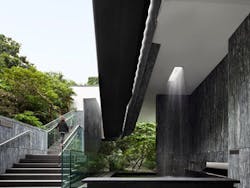
Combining historical buildings from the British colonial period with an angular footbridge and a glass-wrapped modern pavilion, the Asia Society complex in Hong Kong spans eras, cultures and styles. They connected the three 19th-century buildings to an extant 1940s structure via a footbridge that cuts a sharp "V" line through the verdant setting, and inserted a new 11,000-square-foot pavilion behind the younger building. The zigzagging bridge through the greenery, covered like many walkways in traditional Chinese gardens, yields expansive views of the city.
Case Inlet Retreat; Lakebay, Washington
MW Works | Architecture+Design
© Jeremy Bittermann
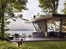
The design brief called for a modern, low-maintenance abode that had a strong relationship with the land. The architects devised a solution whose simple forms unfold into the landscape, offering a unique interaction with the site in each room. The living space projects west into the tree canopy on a cantilevered platform, capturing views of the water and sunset. The kitchen reaches out through a sliding glass door to engage the meadow and the afternoon sun. The site permeates the building, through its ample windows and doors that bring in daylight, views of the Olympic Mountains and natural ventilation. Its concerted use of rugged, natural materials that complement what is found in the local landscape and also reinforces a sense of context and connection.
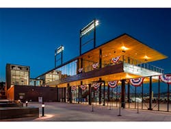
CHS Field; Saint Paul, Minnesota
Snow Kreilich Architects, Inc, Ryan A+E, Inc. and AECOM
Working with the St. Paul Saints, an independent league franchise, and the City of St. Paul, the architects slipped a 7,000-seat ballpark into a remnant site between an interstate highway, an elevated bridge, a light-rail operations facility and the historic Lowertown District on the edge of St. Paul's business core. Wherever possible, the stadium is porous, opening itself to the life of the blocks around it. The main entrance frames the termination of Fifth Street, creating a vital connection to that core via an axial view along the street to the historic St. Paul Hotel. The sleek, low ballpark offers powerful views to the surrounding structures, many of them warehouses from the late 19th and early 20th centuries.
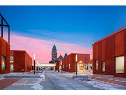
Henderson-Hopkins School; Baltimore
Rogers Partners
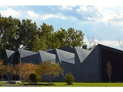
The 125,000-square-foot K-8 partnership school run by Johns Hopkins University in Baltimore is a progressive learning environment for children and a laboratory for the next generation of educators. While most elementary schools are single buildings, the School is a cluster of “containers for learning” inspired by East Baltimore’s row houses, stoops, and social civic spaces. Through its intentionally porous, safe, urban plan, and the craftsmanship of light, materiality and performance, its design respects history and supports the future of education and of its neighborhood.
Mariposa Land Port of Entry Expansion and Modernization; Nogales, Arizona
Jones Studio
Situated amidst the high desert of southern Arizona and Sonora, Mexico, the Mariposa Land Port of Entry reimagines a border station: The public is welcomed to the U.S. by a canopy colored with reds, whites, and blues of a waving flag. Tree-lined walkways and landscape are irrigated by one million gallons of harvested rainwater. Art and poetry are integrated within the crossing experience. Vehicular processing zones guide private vehicles and commercial vehicles, carrying 40% of produce entering the U.S., to either side of a central garden “oasis”, providing officers and staff a respite on site.
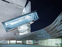
Perot Museum of Nature and Science; Dallas
Morphosis Architects; Associate Architect: Good Fulton & Farrell
© Iwan Baan; Roland Halbe
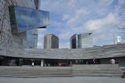
The Perot Museum of Nature and Science creates a new identity for Dallas’ premier science museum, engaging a broad audience with multi-sensory, immersive learning environments. Rejecting the notion of museum architecture as a neutral background for exhibits, the building itself is designed as a didactic tool for demonstrating scientific principles at work. Various strategies are used throughout the building to inspire learning and comprehension, including revealing the building structure and mechanical systems, fore-fronting energy-saving and water-reuse technologies, and integrating local ecologies into the landscaping.
Pterodactyl; Culver City, California
Eric Owen Moss Architects
The four-story parking garage that serves as the Pterodactyl's podium predates it, but was built to withstand the load of an upward expansion. It has an open floor plan suited to contemporary office layouts, and much of its glass front is two stories high, providing an appealingly day-lit setting that a look at the exterior might not suggest. Because it is above many of the neighboring buildings, the west-facing main facade is exposed to sea breezes for passive cooling. Most glazing faces north, and south-facing sections are covered in standing-seam metal panels that reflect the hot sun away from the building.
St. Patrick’s Cathedral Conservation, Renovation & Systems Upgrade; New York City
Murphy Burnham & Buttrick Architects
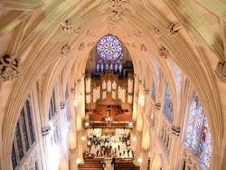
Built in 1853 by architect James Renwick, Jr., St. Patrick's Cathedral has stood as a soaring icon of the spiritual life of New Yorkers. A renovation launched in 2005 touched every building surface, from the top of its 330-foot spires to the bottom, inside and out. At the same time, innovative mechanical and life-safety systems were installed, with minimal intrusion on the splendid visual pleasures of the cathedral. The work was minutely detailed, including a forensic analysis to determine the precise specifications that Renwick made for interior paint and exterior stone mortar. A new closed-loop geothermal system that will rely on below-ground temperatures to displace 240 tons of air conditioning power and participate in winter heating as well.
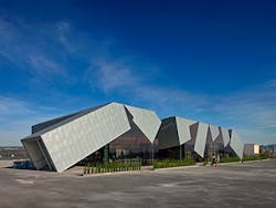
US Land Port of Entry; Van Buren, Maine
Snow Kreilich Architects, Inc. and Robert Siegel Architects
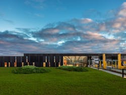
Set on a long, slender site on a bluff over the St. John River, the building is configured as a “Z” to provide staffers shelter from harsh winds, sleet and snow while presenting a sleek profile to visitors and passersby. The rhythmic alternation of opaque and transparent panels on the facade mimics the view between and among trees, while at the same time representing the requisite divisions between public and secure spaces that customs work demands. An exemplary outcome of the federal General Services Administration's Design Excellence Program, the Land Port of Entry skillfully couples a modern set of materials and program needs with an appreciation for regional history and landscape.
WMS Boathouse at Clark Park; Chicago
Studio Gang Architects
© Hedrich Blessing
The boathouse is part of the City of Chicago’s plan to open up access to the Chicago River. It comprises two separate structures, a boat storage facility and field house that form a portal to the water’s edge. Inside the field house, an indoor rowing tank, workout room, and afterschool study space accommodate year-round use. Working within a modest budget, the roof form uses simple linear structural elements and bendable interior plywood panels to translate the motion of rowing into a dynamic surface. Conserving energy through passive systems and keeping 100% of rainwater out of the city’s storm sewer, the project works to improve the quality of the river, supporting its ecological and recreational revival.
2016 Institute Honor awards for Interior Architecture
The 2016 AIA Institute Honor Award for Interior Architecture jury includes: Rand Elliott, FAIA (Chair), Elliott + Associates Architects; Ruth Baleiko, AIA, The Miller Hull Partnership LLP; Barbara Bestor, AIA, Bestor Architecture; James Slade, AIA, Slade Architecture and Lisa Smeltzer, State of Louisiana Facility Planning & Control.
Georgetown University School of Continuing Studies; Washington, D.C.
STUDIOS Architecture
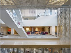
The architects created a space that is light and, thanks to a set of series of hanging staircases in a new four-story atrium, abundantly open for the free flow and spontaneous interactions that a more traditional grassy campus yields. An emphasis on light or transparent materials enhanced the brightness and conviviality that a campus center requires. It helped make the atrium the vital hub of the space, as well as to mitigate the lack of outdoor views from the two lower levels. A perforated metal wall treatment mounted four stories high on one side of the atrium is a contemporary curtain, alternating openness with opacity. In spaces that radiate out from the atrium, angular ceiling treatments and cutouts, horizontal piping in the wood paneling and some exposed utility lines create a visual sense of motion and lightness.
Milton Academy Pritzker Science Center; Milton, Massachusetts
William Rawn Associates, Architects, Inc.
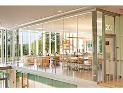
Two goals guided design of the Milton Academy Pritzker Science Center; make science visible and make science exciting. Floor-to-ceiling glass lines the interiors on two levels, allowing students from all grades to see activities in classrooms and dedicated “inquiry labs” where students pursue individual projects. Translucent glass zone provides privacy in front of the seminar tables, while clear glass at the lab areas emphasizes the variety of science activities. Classrooms also face the main campus green, showcasing and emphasizing the importance of science on campus.
PivotApartment; New York City
Architecture Workshop PC
© Robert Garneau, AIA
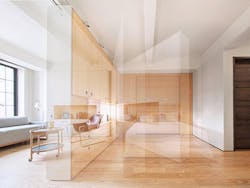
This single 400-square-foot studio apartment has multiple identities. The changes in personality are accomplished with the movement of a wall of meticulously designed custom cabinetry that can stand flat as part of a seamless main wall or pivot out from there to create a new wall that divides the studio. Expertly crafted, the pivoting wall contains drawers, cabinets and openings. A bed concealed in the rear wall can be pulled down into the space or left hiding, to make the space a dressing room or study. With the wall folded flat, out of the way, the studio opens up as one room amply day-lit from the vintage building's big windows. The client, who likes to entertain, can set up a large table for dinners, but when not entertaining a group, folds the table down to a smaller size for its spot next to the galley kitchen.
The Strand, American Conservatory Theater (A.C.T.); San Francisco
Skidmore, Owings & Merrill LLP
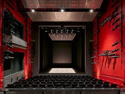
The transformation of an abandoned century-old movie house into a highly visible, alternative performance space for San Francisco’s preeminent nonprofit theater company is a major milestone in the regeneration of mid-Market Street. The redefined space incorporates intimate theaters, educational facilities, rehearsal space, and public lobby and cafe. The program is inserted within the building’s shell, overlaying modern architectural and theater elements on top of the raw backdrop of the original cinema. The design creates inspiring civic theater and dramatically opens the lobby to the sidewalk, energizing the building and neighborhood.
Windhover Contemplative Center; Stanford, CA
Aidlin Darling Design
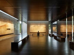
The Windhover Contemplative Center is a spiritual retreat on the Stanford campus to promote and inspire personal renewal. Using Nathan Oliveira's Windhover paintings as a vehicle, the chapel-like center provides a refuge from daily life and a space for quiet reflection. The extended progression to the sanctuary’s entry allows visitors to shed the outside world before entering. Inside, the space opens to the oak glade beyond while louvered skylights wash the paintings with natural light, unifying art, architecture and landscape. Rammed earth walls, wood surfaces, and water heighten the visitor's sensory experience acoustically, tactilely, olfactory, and visually.
2016 Institute Honor Awards for Regional & Urban Design
The jury for the 2016 Institute Honor Awards for Regional & Urban Design includes: Robert Herman, FAIA (Chair), EDA Architects; Christine Dunn, AIA, Sasaki; Mayor Nelda Martinez, City of Corpus Christi; Joel Tomei, FAIA, Joel Tomei, Architect, FAIA, NCARB, LEED AP BD+C and Christine Vina, AIA, VIA Metropolitan Transit.
Fayetteville 2030: Food City Scenario
University of Arkansas Community Design Center
© University of Arkansas Community Design Center
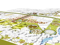
More than 28 percent of Arkansas children live in food-insecure situations, compared to 14.5 percent nationally. The Food City plan, which is being funded by the Clinton Global Initiative, aims to build in to Fayetteville a sustainable approach to combating hunger while permeating new development with productive green spaces. The project team envisioned a way to reduce hunger in the city by integrating a network of mid-sized agricultural sites into the urban grid as it expands. The intent is to “re-localize” food production at a scale that is larger than isolated home garden plots and smaller than the nation's current industrial scale. Future development would include not only the traditional sidewalks, parks and other public amenities, but an infrastructure that supports agriculture with spaces for growing food, distributing it, and turning waste into compost.
Smithsonian Institution South Campus Master Plan; Washington, D.C.
Architect: BIG | Bjarke Ingels Group; GHT Limited; Robert Silman Associates; Stantec; EHT Traceries; GHD; Atelier Ten; VJ Associates; Wiles Mensch Corporation; Kleinfelder; Surface Design, Inc.; FDS Design Studio
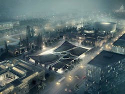
A comprehensive plan for enhancing the visitors' ability to flow through and among the Smithsonian Institution's South Campus museums, this project lays out a 20-year program of building updates and enhancements to 15 acres on the rim of the National Mall. The visual centerpiece of the project is a clever revamp of the garden adjacent to the Smithsonian's beloved castle, designed by James Renwick, Jr., in which the garden, which is the rooftop of below-ground museum space, comes to look like a carpet with its corners flipped up. The project also promises more openness within the castle, built in 1849 as the sole vessel of what is now the world's largest complex of museums. In particular, the castle's lavish Great Hall will be restored to its full grandeur with the removal of modern partition walls that reduce floor area by 40 percent.
