7 emerging design trends in brick buildings
Fired clay brick continues to evolve with new color blends, textures, and architectural shapes that inspire innovative and enduring designs. These design trends are evident in the winning projects from the BIA's Brick in Architecture Awards.
Here’s a look at the latest brick design trends based on recent award winners:
1. Unique brick patterns using different depths and orientation
For the west façade of the 77,000-sf Farm Credit Services of America Corporate Office Building 2 in Omaha, Neb., Clark Enersen Partners created an abstract representation of wind blowing through a wheat field—using two brick colors at various depths and orientation. The west façade brick also helps minimize late day glare, while openings in the façade still filter natural light through vertical fins.
2. Gray and white shades of brick
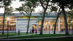
Cougar Woods Dining Hall, a 25,000-sf pavilion on the University of Houston’s main campus, promotes a passive approach to sustainable design. Designed by PageSoutherlandPage, the dining area has extensive glazing on its north side to provide daylighting within the building, while minimizing heat gain. Solid masonry walls with a lighter color were used to protect the southern and western elevations from the sun and reduce the heat island effect.
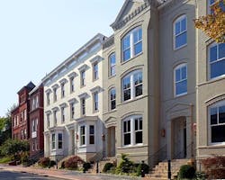
In another example, Wormley School Rowhouses in Washington, D.C.’s historic Georgetown neighborhood were painted neutral colors to match the existing neighborhood. While maintaining historic integrity, Cunningham | Quill Architects converted a school building into condominiums and a new row of townhouses built on the adjacent schoolyard.
3. Brick for flexibility in color, shape, and form
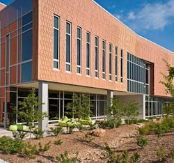
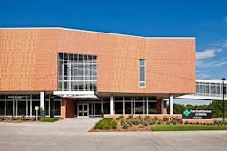
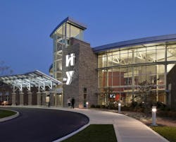
For Hendricks Regional Health YMCA, Avon, Ind., American Structurepoint aimed to celebrate the symbiotic relationship of health and wellness through an integral use of brick and organic forms. Brick was used in areas where there were noise and privacy concerns. A two-tone scheme used a deep brown brick color to anchor the façade and hold up the lighter, buff-colored brick to create a sense of place and familiarity with the hospital brand. Brick easily conformed to the straight, angled, and curved walls throughout the facility.
4. Textures: sanded, artisan, wirecut, and tumbled
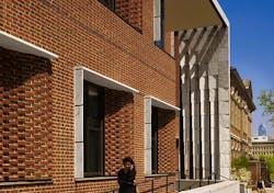
The University of Pennsylvania Law School uses masonry to define the image of a 21st century law school. One of Penn Law’s primary goals was to unify its campus with the addition of the new Golkin Hall. To do so required maintaining the material presence of Silverman Hall, built for the law school in 1900. Kennedy & Violich Architecture used sand-molded brick and a distinctive Flemish bond pattern used on all subsequent buildings.
5. Contrasting brick colors and course patterns
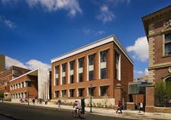
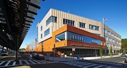
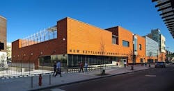
The 172,000-sf New Settlement Campus in Bronx, N.Y., houses three schools for 1,000 PK-12 students on a busy urban block. Dattner Architects interplays massing, materials, and patterning to create scale and interest for the block-long building. A two-story, red brick commons wing parallels an elevated subway train, and intersects a four-story buff brick classroom wing that bends away from the street. The contrasting brick colors and course patterns distinguish the two wings. A graduated vertical pattern of darker projecting brick articulates the classroom wing’s cream-colored brick façade, which is perpendicular to the elevated train to minimize noise.
6. Hinge-shaped face brick
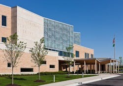
Fountaindale Public Library in Bolingbrook, Ill., is located in a suburban environment at the confluence of the village’s municipal campus, tract housing, and a recreational park. To facilitate the organic shape of the building’s exterior, Nagle Hartray Architecture used an innovative, single modular size hinge-shaped face brick for 28 different inside and outside corner conditions.
7. Brick to introduce new architectural motifs/ornamentation
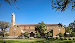
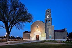
McKinney York Architects designed the 7,000-sf non-denominational Kent R. Hance Chapel, Lubbock, Texas, in the Spanish Renaissance style of the historic sections of campus. The chapel’s bell tower, curved articulation of the gabled parapet walls and ermine patterning of the principal façade are all instances where brick played a decisive role to introduce new architectural motifs, celebrating only the most important architectural elements.
